I’ve always enjoyed the visual components to news; it’s one of the main reasons I wanted to go to conferences like NICAR and ISOJ this year.
Learning how to add visual components with charting has been a really rewarding experience. I had no idea companies like Google had free services designed to help build interactive charts.
Since my project is looking at revenue from Airbnb during SXSW, the best chart for me was a stacked area chart which allowed for a dynamic line to suddenly rocket up during the SXSW weeks. Because of this, I found the Highcharts to be the most helpful tool I used. It was simple to plug in my data and get the exact look and result I wanted in a chart. Ideally, I would like to animate my chart, similar to the 100 Years of Rock interactive piece (with a much less complicated timeline, naturally), that Kathryn showed us earlier in the year.

I feel like this chart is a good visual representation of what prices for Airbnb look like in Austin and allows for that very dramatic rise during SXSW.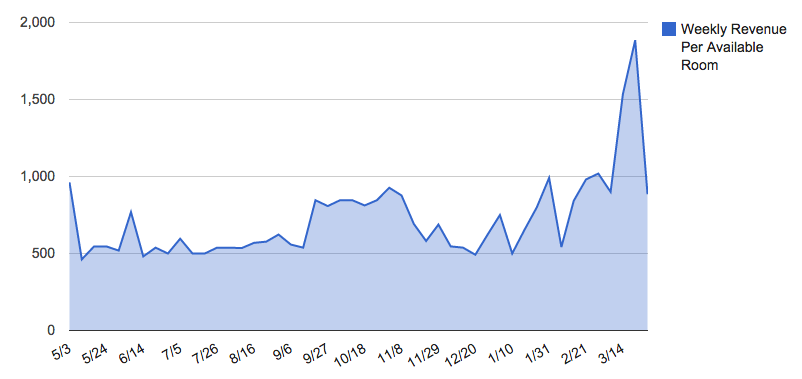 By contrast, I felt like the Google Charts API didn’t have as much pop to it. I like the individual points that give data when you hover over them (obviously, not on this page since it’s just an image) of the Highcharts better than the Google version.
 Certainly, the bar chart from ChartJS was not an ideal way to display so much data. Although changing the CSS to make the bars larger and easier to see would help, but it would still just be an overwhelming amount of data in bar chart form.
Finally, I played around with Google Fusion tables, but because I don’t have any mapping data, they end results weren’t very good. Fusion tables make organizing lots of different data more manageable, but since my data is simply a date and an amount of money, it actually became more complicated and difficult to use than the other charts.
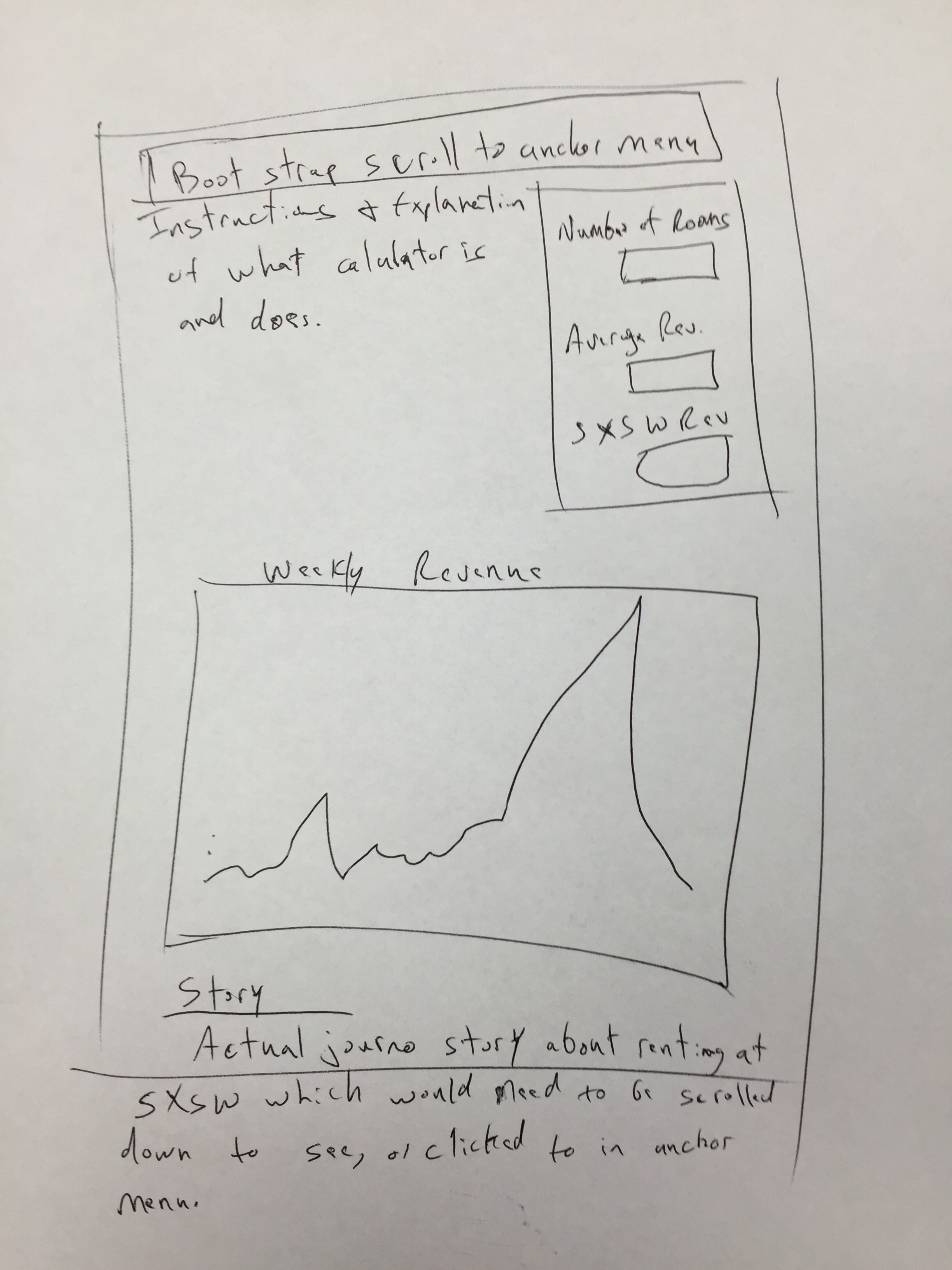
Final Project
For my final project I would like to take a chart like the Highchart shown above and make it more dynamic. If I can figure out how to animate it, then I will add in an animated chart that scrolls across the year as it progresses. If I can’t, then I will put in a slider that allows people to move throughout the year and see what the difference in price looks like. I will also add in the major events of the year on top of the chart, like SXSW, FFF, and ACL.
My other portion of the page will allow users to put in their number of rooms, and based on Austin averages, see how much revenue they would make during a normal time of the year versus how much more they will make during SXSW.