So for my graphing endeavor, I decided to use partial information from my final project as the data for this project. I collected information from the Texas Music Office for resources available to artists in Austin and Dallas and compared the two to see how the “Live Music Capital of the World” stacked up against other major Texas cities. The conclusions, even while partial, are interesting.
Graph One (chart.js)
The first thing I don’t like about this chart is it doesn’t allow you to put a title at the top or a description along the x-axis. It is also more difficult to customize than the highchart charts. This chart however is easy to make in a hurry, the info just gets plugged in very quickly and if you need a quick turnaround without a need for detailed information, this is the chart I would consider using.
Chart Two (Google Charts)
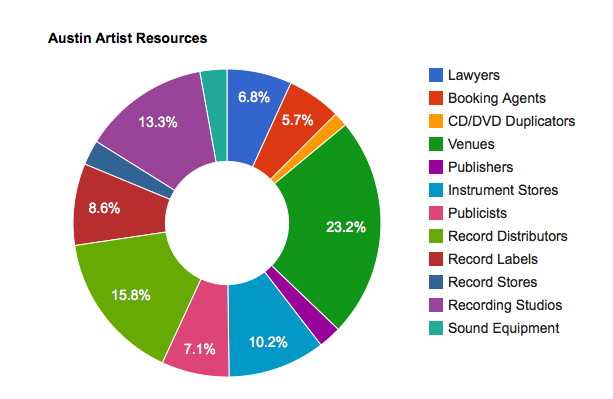
The Google Chart is very easy to use and very visually appealing. There are also a wide variety of charts to use. The drawbacks are that there is limited ability to customize the chart, it’s a little bit more of a WYSIWYG type of service. This is a chart I would consider using to show each individual city and the resources available and have the 5 city’s pie charts lined up side by side.
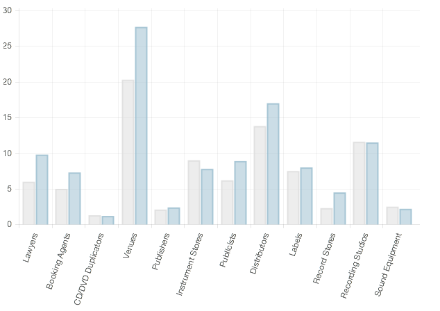
Chart Three (highcharts)
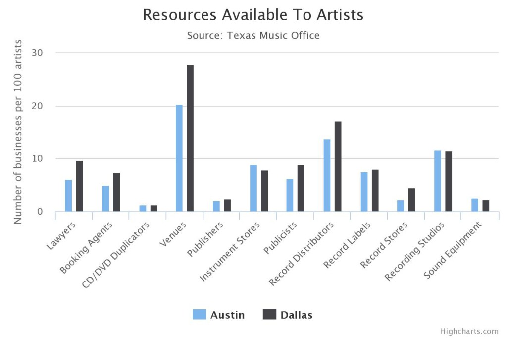
Ok, I’m not going to lie, I fell in love while using highcharts. They have a wide variety of charts to use, which were a little more complicated to figure out than the first two charts, but I will definitely be using highcharts in my final project to show the difference between resources available in five major Texas cities. I really like the design of the graphs they have available and might choose to go with something other than the bar graph, but so far the bar graph is the one that works best for the data I am presenting.
Fourth Chart (Google Fusion Tables Heatmap)
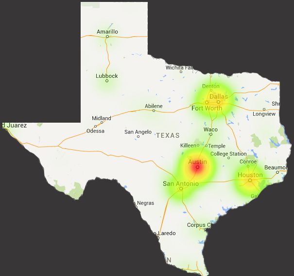
First, I had to crop out Texas myself. Second, I used the Texas Music Office’s listing of bands and then fed them into Google Fusion Tables only to be told that the map would be limited to the first 1,000 entries. There are over 5,000 bands so sadly this map isn’t representative of the actual listings. I found sources other than Google Fusion Tables that allowed me to make a heat map with the total amount of entries, but their rendering of the maps had less of an aesthetic quality.
FINAL PROJECT
For the final project I plan on using both the Google Charts Doughnut chart and the Highcharts multi-bar graph.
The information I plan to show with the Google Charts Doughnut is a breakdown of the services offered in each city. I think this will give a better rendering of what each city has in terms of resources and how those resources compare to the whole.
The Highcharts multi-bar graph will show the resources for each city compared to each other. I plan on evening the playing field by using “resources per 100 artists” versus the total number. This will make it to where the cities can actually be compared to one another apples to apples. I have 12 different categories and 5 different cities, so this option seems to be the most logical and direct route to telling the story.
The story I am trying to tell with this information and these charts is that while Austin may be the “Live Music Capital of the World” it doesnt have the world’s best music resources. Other Texas towns with fewer bands have more crucial resources that musicians need and Austin musicians are having to go elsewhere to get their needs met.