Interactive data has been able to give the public a new source of better entertainment through knowledge and keen design. My favorite interactive data visual was the Opportunity Gap. Education that is at its best quality for all is an important goal. This application was able to let the public understand where their schools stand and where they should improve.
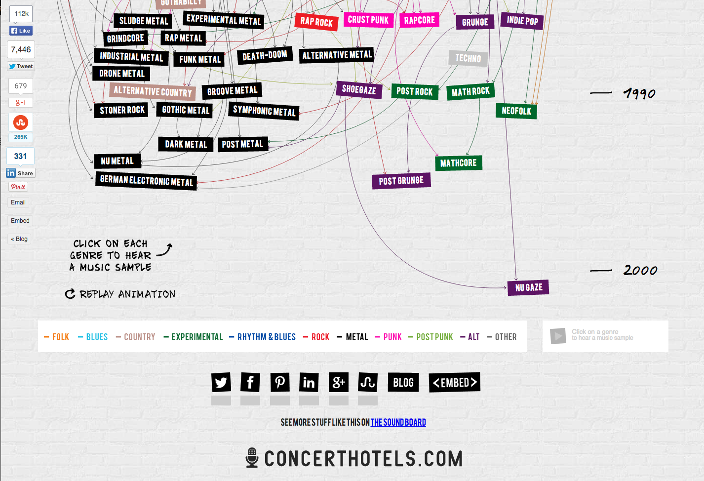
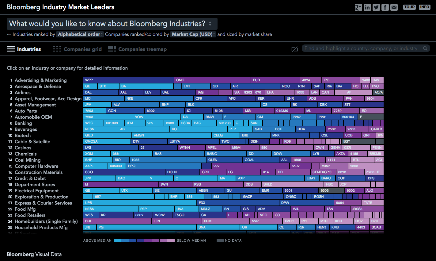
My two favorite interactive data visualizations are 100 Years of Rock and Bloomberg’s Industry Market Leaders. They both can give an audience a huge amount of data at the click of a mouse. In 100 Years of Rock people are able to visualize how this music genre was started and can research different subgenres. For Bloomberg’s Industry Market Leaders a person is able see to how big a company is in a particular field or value. They also both look beautiful.