The first charting tool that I used to examine the datasets I’ll be using for my final project was Chart.js. The site and associated github were very easy to navigate and start working with data immediately.
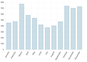 I used the sample bar chart
to input public data from Austin’s 3-1-1 service request records. All records referenced “loud music.”
I modified the chart code to accommodate only one set of data. You can see right away that there is a large spike in loud music complaints in March of 2014, the year this data was taken from. This implies an association with SXSW.
You can view the interactive chart here.
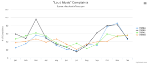 The next tool I worked with was HighCharts. I was impressed by the in-site editor which allowed you to input your data and then run it in real time to see your chart as you progressed.
I used Highcharts to examine the top four zip codes in Austin with the most loud music complaints and chart their complaints over the course of a year. I found this really useful for seeing what areas complained the most at different times, which can be correlated with different music festivals around the city. You can see the interactive chart here.
I w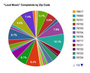 orked next with Google Charts to conduct a little experiment with myself. I wanted a way to visualize the noise complaints as a whole with each zip code being a contributor. Readers need some way of seeing the entire picture but also need the ability to single out which zip codes are relevant to them and which ones contribute the most to the issue. So I attempted to put this all in a pie chart. I very quickly realized it was a lot of data for a pie chart, and I think overall the visualization lacks clarity and fails to do what I hoped it would. The site was incredibly easy to use though, and this experiment helped me understand that pie charts, while traditional, can be confusing visually. You can see the interactive chart, which is a little easier to understand given the scrolling capabilities, here.
The last charting tool I worked with was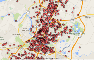 Google Fusion Tables and right away I could see that this should have been my very first step. Fusion Tables makes manipulating your data and organizing it in different ways very easy and the resulting filters and summaries are essential steps in telling a data story. I was able to quickly organize my data along certain lines (zip code, council districts, etc…) and get counts for each of those variables immediately.
The mapping function was also fantastic though customizing the map and making sure it’s showing the information you want takes a little time.
You can see the map here.
Overall these exercises helped me realize how many different kinds of visualizations there are for big data and got me thinking critically about what charts and infographics are best suited to what stories. For instance, the pie chart above doesn’t help tell my story, but the line graph does give us a quick picture of what times of year are the worst, in terms of loud music stress in a community, for each of the zip codes graphed. I can then add information about what is taking place close to those areas at those times to support my implication that the complaints are related to festival events.
While adding a visualization doesn’t necessarily make your story better, it can be an essential tool when large amounts of complex data are being used. Anything that makes something clearer and more memorable is very valuable for the data journalist.
 Final Project
I’ve made some changes to the story I hope to tell with my data that are really inspired by our talks with Trei and Skip from Vox and their suggestion to increase interactivity and the desire to share something.
Originally I really wanted to focus on the intersection of housing issues and noise complaints in Austin, but increasingly I’m finding that multiple sources are telling, and have told, this story already.
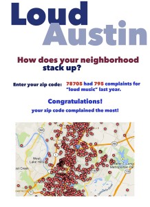
Instead I want to focus on robust data for the noise complaints, specifically those referencing “loud music” and build an app that allows people to see how much their area, or whatever area they’re interested in, actually contributed to the number of complaints.
Not only is this a cheeky and fun way to tell the story, it gets people involved and keeps them on the page longer. They might want to look up their own zip code, or a friend’s, or that of their favorite venue.
I also have information on which council districts have complained and in what number, which would be interesting to cross-reference with those city officials’ responses to noise complaints.
I think this is a new and innovative way to tell an ongoing story. Instead of focusing on the text or anecdotal aspect, providing people with the data and allowing them to interact with it might have an even bigger impact. Realizing that your zip code has complained the most about loud music might make you look at your neighborhood and rethink the music scene and how residents are reacting to it.