This site breaks down two federal programs that fight child hunger: the National School Lunch Program and the Summer Food Service Program. Data from data.gov was used for this project dating back to the 1960’s. The intended audience for this project
Getting a Data Picture of NYC
For the charting exercise I decided to take five different data sets that have something to do with New York City and make an interesting graphic/ chart representation of each. This project uses Charts.js, Highcharts, Google Charts and Fusion Tables.
#ToneDownForWhat
For this Twitter API exercise I wanted to use a fun trending hashtag that popped up during the latest riff between Hillary Clinton and Bernie Sanders. When Bernie Sanders proposed a democratic debate with Hillary Clinton in New York, Clinton’s chief strategist
Thinking of News Apps as Durable Products
The Delivering Data chapter of the Data Journalism Handbook offered really excellent insight into best practices for working with and delivering data products as a journalist. I appreciated finding out that even for seasoned data journalists, workflow with data begins
Which country has the best maternity leave?
Using the same data set that I mentioned in my last post, I decided to dive in a little deeper and make some charts to see what information the data had to offer. Unfortunately, as with most data sets, I
Maternity Leave Data Visualization
For the final project I plan to explore an issue that is both local and national – maternity and paternity leave. This data set from the United Nations data portal provides data for maternity leave in every country. Not only does
Which type of yoga is right for you?
The Idea The yoga craze is here to stay, and if you haven’t sun salutationed your way in to a yoga class by now your friends have probably left you in the dust. Maybe all of the bending and stretching looks to
Visualizing Stories that Matter

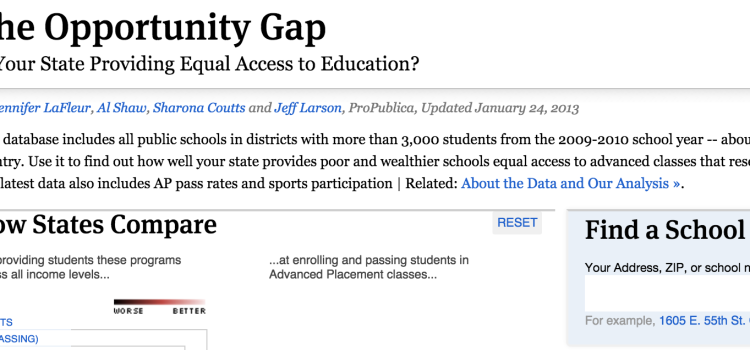
There are a lot of great case studies of web apps that visualize interesting stories in the Data Journalism Handbook, but I’m always drawn to a story that is made more human by visualizing data in an unique way. The Opportunity
Meet the Student: Becca Silvas
I’m a third semester graduate student studying mass communication at Texas State University. With a grad concentration in global media and an undergraduate degree in International Studies, I’ve long been interested in international politics and communication. In the summer of