The Delivering Data chapter of the Data Journalism Handbook offered really excellent insight into best practices for working with and delivering data products as a journalist. I appreciated finding out that even for seasoned data journalists, workflow with data begins with simple charts in excel. It’s important to really get familiar with the data that you’re looking at before you dive into a project. ProPublica even emphasized that it’s pretty difficult to make a good news app without fully understanding the material first, which means you may need to do extra research to verify that you understand all parts of the data and are prepared to represent it accurately.
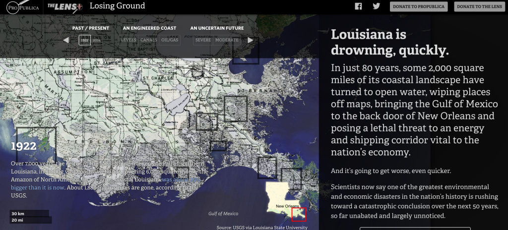
I also appreciated the emphasis on really starting to look at news apps as durable products. The best news apps outlive the news cycle and can be returned to again and again. Not only do these types of apps endure online, but also reporters and developers can more easily justify the time and money spent on them. I’m particularly inspired by data products that tell the story of not only the current data, but also go into the history of events, like ProPublica’s Losing Ground app about Louisiana’s coastline.
In news app design, it’s important to design for two types of readers: skimmers and divers. Readers need to be able to glance glance through the app and understand the headline immediately. Just like a news story, a news app needs a headline and a lead worked into the design. If these two things aren’t immediately apparent, the news app isn’t serving it’s highest function. It’s important to decide on the overwhelming impression that you want the reader to get and work backwards from there.
In my final project I want to focus on telling the big picture story immediately and visually. I think that if you have to have a lot of text to explain a graph or chart, it probably isn’t a great visual. With my previous maternity leave data example it would be important to really understand each aspect of the data before I go through with visualizing the best places for new working mothers. Like the ProPublica example pictured above, I would need a clear headline and lead that tell the story quickly, and interactive maps that let the data speak for itself.