Using the same data set that I mentioned in my last post, I decided to dive in a little deeper and make some charts to see what information the data had to offer. Unfortunately, as with most data sets, I had to do a little bit of work to be able to pull meaning from the figures. Length of maternity leave numbers varied from years to weeks to days, so I first converted all of these figures to the nearest whole number in weeks. Then I had to decide which information to compare between country, length of maternity leave, percent of wages covered and provider of the benefit. First I wanted to compare a few countries in length of maternity leave to get a picture of where the United States stands compared to the rest of the world. For some initial insights, I pulled a few countries into another table and made a chart comparing their maternity leave lengths in weeks.
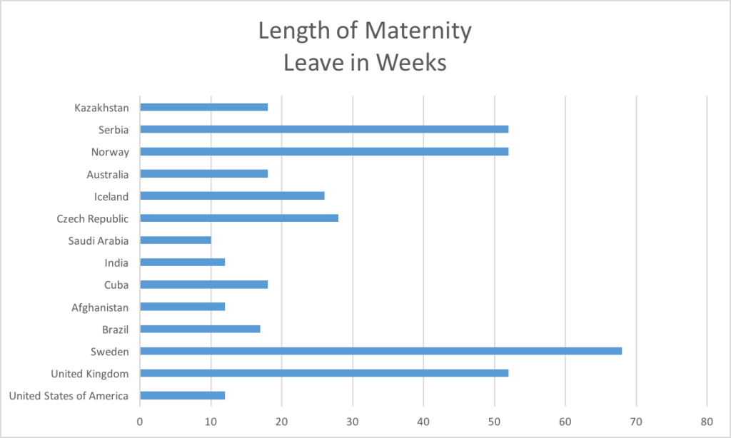
This initial chart suggests that the US falls far behind on length of maternity leave compared to its european counterparts, and even falls behind compared to some other surprising countries. The average length of maternity leave in the US at 12 weeks is dwarfed even by Cuba’s 18 weeks and Brazil’s 17 weeks.
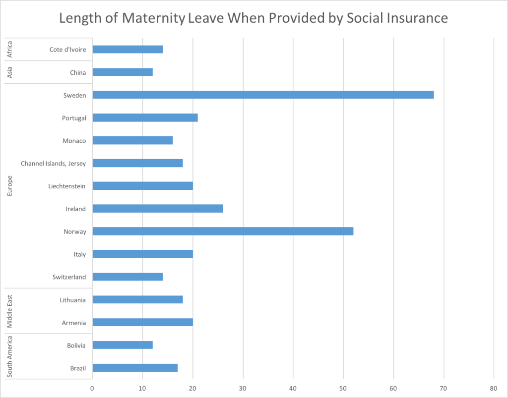
Next I wanted to take a closer look at the length of maternity leave in countries where the benefit is provided completely by social insurance and not the employer. To compare overall regions of countries with this type of benefit I added data for each region. With this chart, I was able to start making some valuable comparisons between countries and regions across the world. Compared to other regions that offer paid maternity leave provided by social insurance, Europe leads the pack in number of weeks offered.
The charts produced from this data set give me some ideas for what other information I would need to create an interesting data visualization. This data lends itself well to a heat map visualization that could show where the best benefits are for maternity leave. I would also want to do further research into the specifics of how the benefit is provided in each country, that might pop up when the reader/ user hovers the mouse over the country, to explain where the benefit comes from, how it is paid for and how long it has been in place.