There are a lot of great case studies of web apps that visualize interesting stories in the Data Journalism Handbook, but I’m always drawn to a story that is made more human by visualizing data in an unique way. The Opportunity Gap from ProPublica takes an intensely complicated data set and tells a story that every single reader (or rather user) can relate to. This web app uses data from the U.S. Department of Education to compare access to advanced courses in public schools. As both a national and local story, this idea lended itself perfectly to a web app.
In the case study, I love what Scott Klein of ProPublica says about finding the story in data and thinking about how the reader can use something they know to find out something they don’t know. The reader/user has the opportunity to see that national story, but also has a unique ability to see the local story that matters to them.
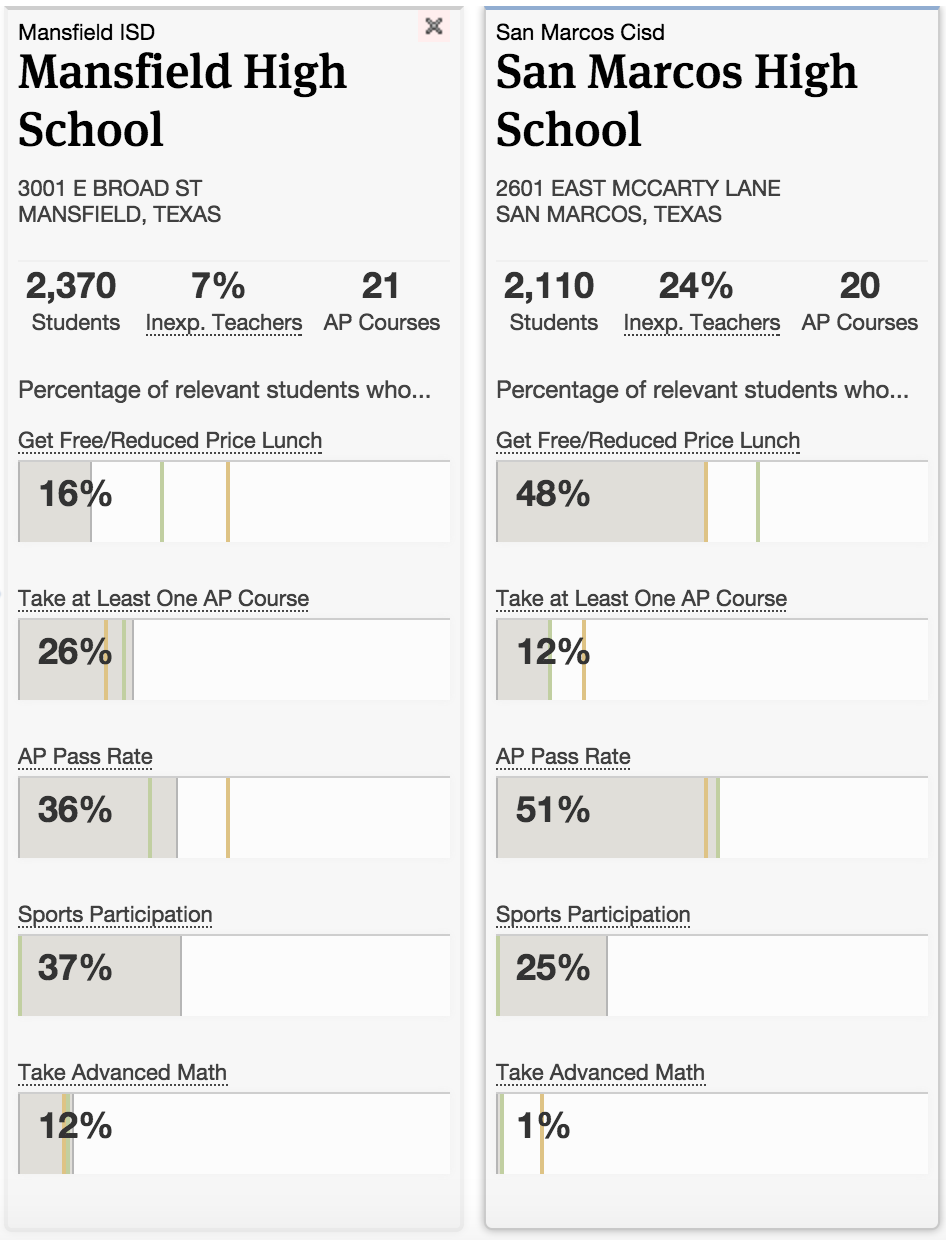
On the home page there’s a national comparison of AP enrollment and pass rates between states. At a glance I can compare how well different states provide AP classes across income levels. Then, if I haven’t already gone for the local story and searched for my school district in the “Find a school” form, I can click on Texas and see some more detailed stats about my state. As I dig further I can easily find my school district and my high school, comparing them to state-wide statistics all the while. What I particularly love about this story is that I can also compare my high school to any other high school in Texas. I chose to compare my alma mater to San Marcos High School, and get a snapshot of how the schools differ. There’s definitely an opportunity gap there.
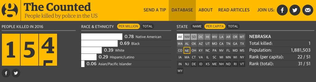
Another favorite interactive data visualization of mine is The Counted, produced by The Guardian. This site not only reports the statistics of people killed by police in the United States, but simultaneously puts names and faces to those victims. I think this is genius. We hear so much about the numbers for people killed by police, but this visualization offers a rare humanization of those statistics. This visualization is again made into a local story via user action. I can hover over Texas and see that 16 of the 154 total people killed so far in 2016 were in my state. I can also click on the map for a better sense of where these incidents are happening across the country.
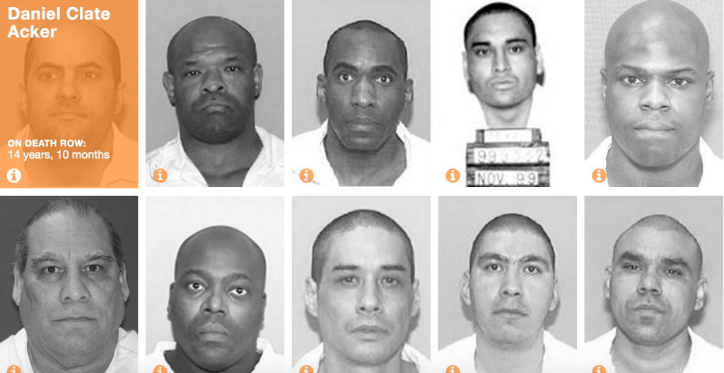
Faces of Death Row produced by the Texas Tribune is a similar idea that puts faces to a politically charged issue that people often feel very strongly about. Thanks to the unique features of an interactive web application, readers are able to engage with the story. I love that the sheer number of inmates is allowed to speak for itself, with only a short paragraph at the top of the page that tells the story succinctly and powerfully.