 As was probably evident from my first post, I adore data journalism. My favorite of the case studies was the Wikileaks piece. It may be my bias towards Simon Rogers, but I thought his breakdown of IED attacks in Afghanistan was very interesting. The sheer volume of data they went through is staggering, and the results are informative and visually striking. The team at the Guardian took the massive data set and filtered out the story they were looking for, mainly IED attacks. Once they compiled all the IED data, they were able to generate a map showing the veins of attack that formed in Afghanistan.
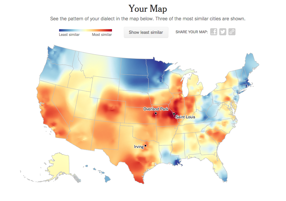
There are a lot of things I love about data visualization, and this map is certainly one of them. It comes from the New York Times speech quiz. My results are a pretty great representation of where I have lived. I grew up in St. Louis, so naturally my biggest area of influence came from there, but I’ve also lived in California and Texas, and those places have influenced my language as well (y’all didn’t used to be a part of my speech). This simple quiz, as we discussed in class, became one of the most popular posts the New York Times has ever had.
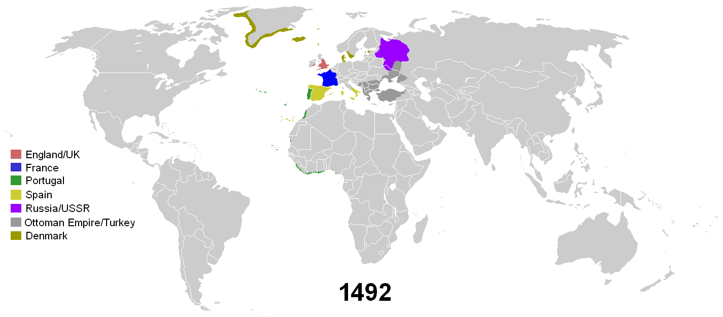
As I discussed in my first post, I adore Vox. One of the reasons for this is their great data visualization work. Recently they posted an animated gif that is brilliant and striking. The gif, showing 500 years of colonialism in one map is so compelling because it puts into perspective not only how large some empires became, but also how quickly those empires receded back into their normal territory.
It’s really difficult for me to choose a favorite data visualization story. Although the speech map is always in my list of great posts, the colonialism map is only a few weeks old, which is probably why I enjoy it so much right now. Much like data journalism, my tastes and favorites are constantly evolving.