 Interesting data visualizations and storytelling:
“… there’s a good case for saying this made the war the most documented in history.”
That really stood out to me while reading the case study over the Wikileaks article in this chapter. It revealed how necessary data is to our society and how great it is that we have the ability to make use of this data in journalism. We can stay up to date on the world with actual numbers, it’s not just word of mouth anymore. As media professionals, we want to do whatever it takes to have the most reliable sources and there’s nothing more reliable than numbers.
#1: The History of Cultural Migration: Mapped
This data visualization maps how culture has moved around the world through time. It is interesting to know where the world’s intellectuals have started and finished and to know how they have impacted the way our culture is today.
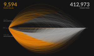
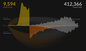
#2: A Visual Exploration of US Gun Murders
I was really intrigued by this data visualization, it was so detailed and made the deceased individuals more than just a number. The stolen years counted on the graphic gave a considerable amount of impact to the visualization itself. This data
makes murder less of a day-to-day news story to society and more a hard-hitting social issue that needs to be addressed and fixed.