With the amount of festivals popping up in all corners of the state, I decided to create concrete visual of where to find them. I found the data from Find Festival and mapped it out on a map using the Google API. The site had data from all different types of festival across the country including cultural, film etc. I narrowed down the information to music festivals divided them by city and month. 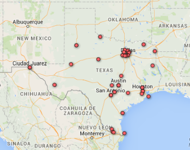 I first used the Google Fusion table to place all the cities in a map for easy visibility. I found Google Fusion to be really easy to use and to a point fun. Utilizing their services makes data visualization an easier concept to comprehend for someone starting out. I found that placing items with location points was much more appealing than a heat map.Click here for maps
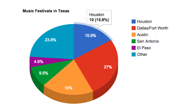
The second charting tool I used was the Google API pie charts. In this chart I separated the festivals per top cities in Texas. The rest were clustered together as “other”. Not surprisingly, Austin is the most popular though the pie graph will state otherwise since the entire Dallas/Fort Worth area is clustered together. I enjoyed the interactive nature of the application and would probably use it in my final project .
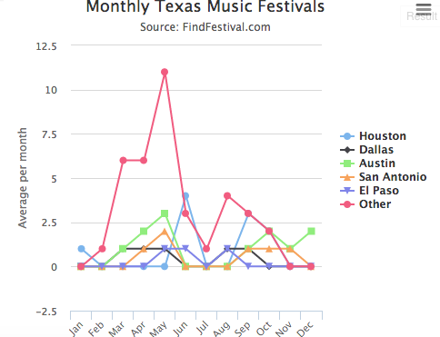 Finally the last tool I used was HighCharts. Definitely my favorite tool to use thanks to the interactive ability to edit right on the page. I will definitely use this tool for my final project. Here I separated all festivals by month date and clustered them by the top cities in Texas. The rest of the outlier cities are clustered under other. According to the data, Texas experiences the most music festivals during the month of May. Here for the link.
Final Project: 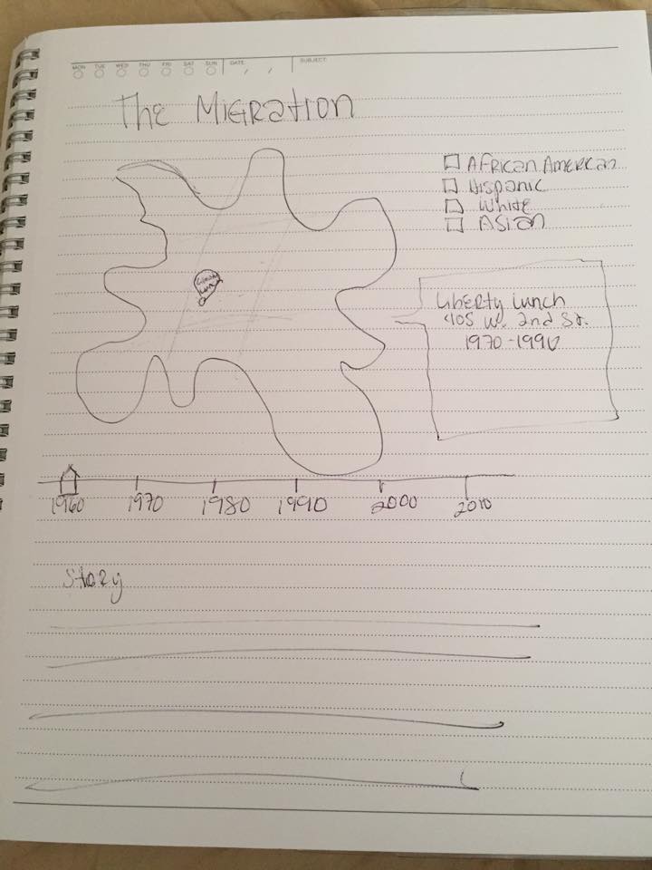 I am in the midst of collecting data and housing demographics for Austin from 1960-2010. I have found through various websites the heritage music venues from each decade from websites such as Phosphene Productions and Wikipedia amongst others. My plan is to position each venue using the Google Fusion map contrasting the demographic and housing information at the time. This map was taken from the Austin American Statesman where they showed the changing face of Austin. I would like to make my own map more interactive by having the demographic shift through the decades and show where popular venues were located at the time. In addition tI would like to have a small “About” over each venue with information on their music genre and their catered demographic at the time. Through research I have done there seems to be enough information on landmark venues. I would also like to add a small story at the bottom from people and their opinion over each venue.
https://jsfiddle.net/stalacu1622/phtwttfj/embedded/result/