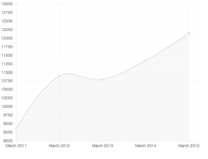
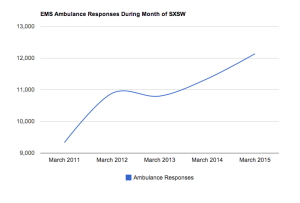
I used the data from the past five years on the number of EMS Ambulance Responses from the months of March during SXSW. The first, Chart.js was easy to use and I liked that in the line chart it had actual points where the data needed to be shown.
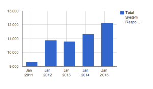
I got a bit irritated with the fusion tables because it would not let me change the months at the bottom from January to March for some unknown reason. My fusion bar chart is still interactive and shows that the month data is from March when you scroll over each bar. I stuck with line and bar charts to show the trend and increase of responses year by year.
I really enjoyed working with Highcharts, it was simple to understand and offered a lot of super cool options for graphs. I would have definitely loved working with other graph types if my data made sense in any other charts. I used a different bar chart that showed the actual number of responses on the individual bars.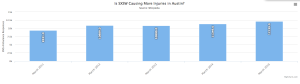
The last chart I worked with was the Google Charts API, I worked with a line chart and liked the fluidity of it.
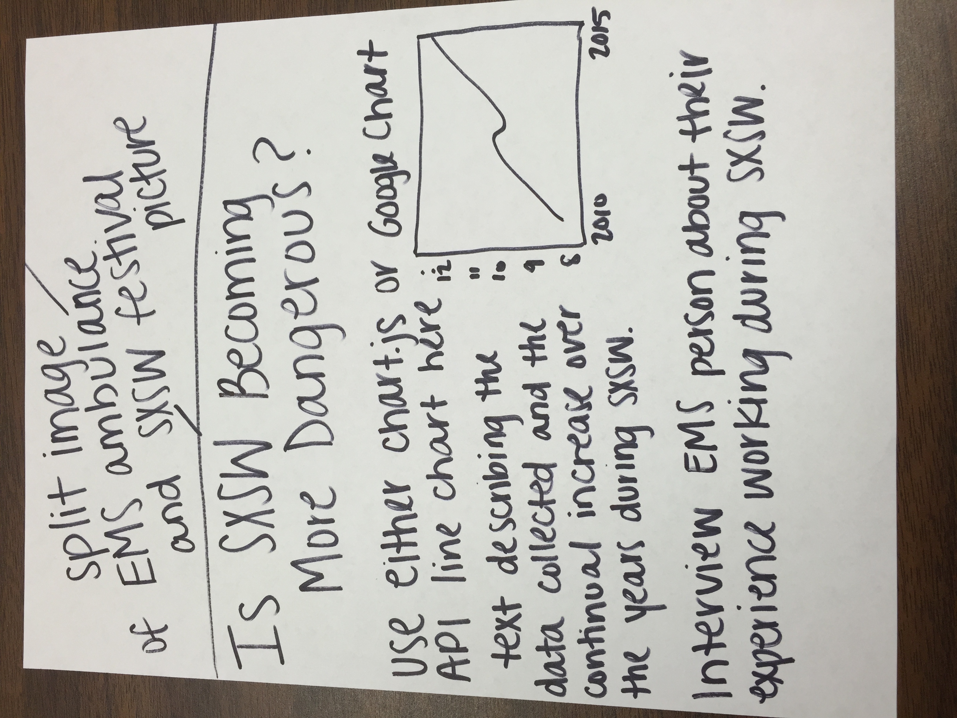
FINAL PROJECT SKETCH:
I collected data of EMS Ambulance responses over the past five years. It has data the amount of responses from every month within each year. I narrowed the data down to the months of March to specifically show the increase of emergency responses during SXSW from 2010 to 2015.