My final project, Airbnb During SXSW, attempts to answer the question of just exactly how much Airbnb prices increase during SXSW. It turns out, a bunch.
Basically, when SXSW rolls around, Airbnb’s go up 155%. I got my data from AirDnA, a website that specializes in tracking Airbnb numbers.
When I first approached this project I ran into several big stumbling blocks. First of all, data wasn’t readily available. I contacted Airbnb and they lied and told me that they don’t have any data like that on file. Thankfully, I was able to find AirDnA, but it unfortunately only showed the last month and I wanted to be able to show more than just that. Doubly thankfully, they had another data set available that covered the last year in Austin for Airbnb.
Once I had the data, it became very clear that a pie line chart would be the best way to display it. I toyed around with some other presentations, but the line was the easiest way to depict the change in Airbnb prices over the last year, especially with the dramatic spike at SXSW.
After I had built the Highchart, I knew I wanted something else, and inspired by school segregation piece I saw at NICAR, I knew what it would be.

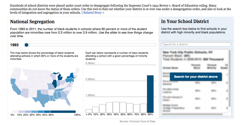
That may seem strange, but one of the components of their site was a spot where the user could search for his or her school district and find out the history of segregation in said school district. Obviously, I didn’t have as much data to display, but I liked the design, so I borrowed heavily from it. I added my own calculator to the page so that the user could see what his or her rental would be worth during a normal time of the year and during SXSW. The column design mimicked the segregation history page, even if the content was not as serious.
I had a lot of issues building the site. My understanding of Bootstrap was never all that great, and I certainly needed a lot of reminders to help figure out the design. On top of that, I wanted the site to look cool, so I had to figure out parallax scrolling and a scroll-to-anchor nav system. Basically, I lived on Google for this whole project.
Another issue I had was just getting in touch with people that had rented their places out or had used Airbnb during SXSW. I tweeted a few times and never got any traction. Thankfully, Cindy put me in touch with three people who had all rented during SXSW. Unfortunately, only one of those people got back to me after I sent them the email questionnaire.
I really enjoyed my time in this class. Although there were certainly times when I felt overwhelmed and underprepared, when we went to the many conferences I attended this semester, I felt like I was ahead of the game in a lot of aspects. I could do a lot of the things that professional journalists couldn’t, and the things that people were talking about slowly started to make sense. I had several “Oh! I understand that!” moments throughout these conferences.
The below gif I feel accurately represents me during this final project. The office could’ve been on fire, and I would’ve barely registered acknowledgment and fallen right back into coding. And I think that’s the sign of a semester well spent.
