 Building this final project has been difficult and rewarding – it has forced a new level of comfort with old skillsets and has catalyzed the learning of a few new tricks.
Working with data was not something I would say I had a passion for early on in this semester, but what I have grown more and more excited about is the process of finding the best and clearest way to illustrate data for an audience.
Telling a story with these kinds of rich illustrations adds exponentially to the experience and understanding a reader might hope to take away. I’ve enjoyed working through that process.
 One thing I’ve learned is to really stick to my vision, while keeping an open mind about how to execute it.
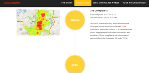
I knew that I wanted a visually engaging timeline element in my site, and that I wanted to incorporate maps associated with each month. While it was tedious to organize my data and map each section of time, I believe it really paid off in giving the reader an idea of what the city’s noise-complaint landscape really looks like at any given moment.
I had to be open, however, to the way I was going to incorporate this timeline and ended up customizing, and building animation into, a vertical bootstrap element. I think it turned out better than I had envisioned it and the large bootstrap icons really make the look.
 Probably my biggest takeaway from this assignment is that efficient code takes time and a lot of skill. Getting things to work isn’t always that difficult but writing clean code without a ton of redundancies is. It took the majority of my time just working through coding problems to try and find better more efficient ways of achieving my goals.
The biggest example of this is one of the largest parts of my project, though ultimately it takes up a small amount of space. Rewriting code to display specific Google Fusion Table maps based on a reader’s input in a form took the majority of my time. At this point, I have JUST gotten the javascript to work to dynamically generate each map based on a url id, latitude and longitude taken from the script provided by Google. This removes the need to have each embedded map hidden in a div, which removes the problem of the map rendering improperly when the div is shown.
I would say this has definitely been my biggest lesson this semester – getting things to work and getting things to work perfectly are very different. The latter pays off in terms of user experience and the overall impression of your work; it is always worth the time.