Though originally I wanted to take data from Texas State Controller of Pubic Accounts and Mixed Beverage Gross Receipts Tax Receipts, using it to show how businesses with event permits during SXSW increase their revenue through alcoholic/mixed drink sales, I found the data from each too unwieldy and difficult to work with. Instead, I’ve found 2015 SXSW Band Schedule, which lists all bands in all genres that performed at multiple business across the festival. The data contains the name of the bands, at what venues they played, the time they played and even the genre of music they specialize in. Using this plethora of data, I experimented with multiple charts, comparing the number of bands genres that performed at SXSW, and even the businesses that held the bands at their venues.
Although I’m still compiling my datasets with the number of genres at SXSW 2015, I experimented with the Google Fusion Tables, comparing the number of music genres that were at the festival. My Google Fusion Chart, Band Genres at SXSW, compares Blues, Funk and Jazz bands. In my Google Chart, I compare the number of bands and their respective genres that performed at SXSW. I do the same in my Chart.js chart. Finally, I compare the number of venues that had bands (Blues, Jazz and Funk) perform with a High Chart.
I found the Google API Charts and the Google Fusion charts much easier to use, letting me display data quickly without worrying about the complex nature of coding. High charts and Chart.js were difficult to use, especially when working with so much data.
Final Project Synopsis
Once I have scrapped the band data from the 2015 SXSW Band Schedule, I will have a complete set of data of the bands that played at SXSW and the genre of music they specialize in. Using this data, I will show which genre was the most popular music genre at SXSW and which venue showcased what genre of music the most at SXSW. I will also be able to determine which venues have the most bands at SXSW. I have plenty of visual material (pictures of bands/venues) to incorporate into my site to make it visually appealing to the viewer.
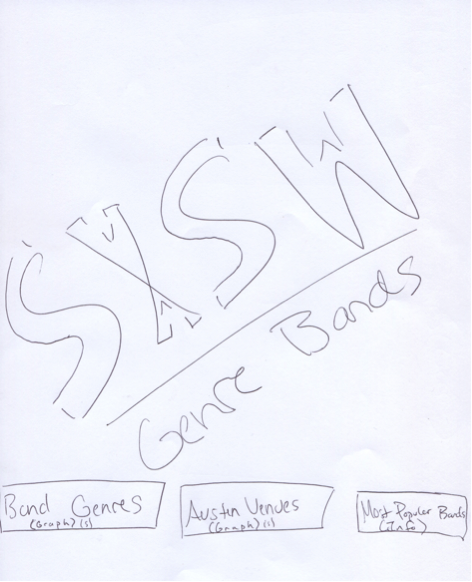
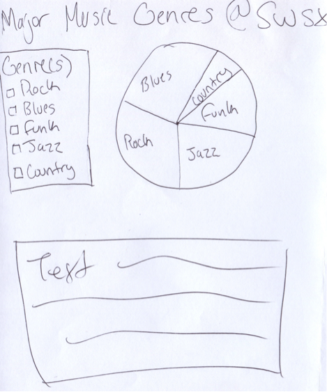
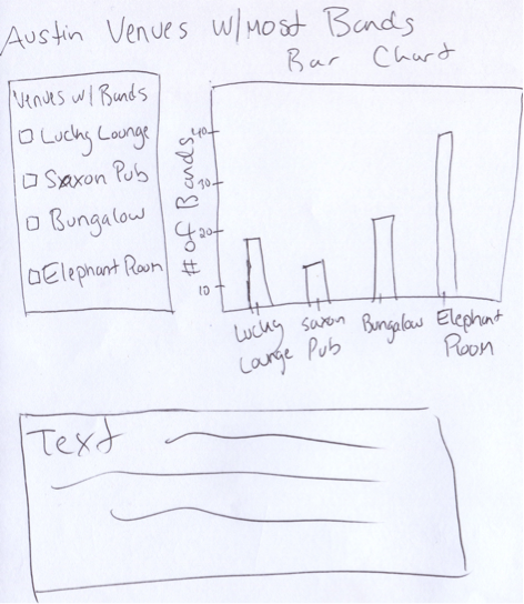
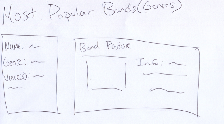
Below is a rough concept for the website. The title page would make use of a colorful banner, letting the user know that the site is dedicated to the various venues and bands (genres) that were at SXSX 2015. The second page would display the major music genres that were at the festival. Like I showed above, using the Google API Charts would be an effective visual representation of the number of genres that performed at the festival. The third page would display the the number (Google Fusion Chart) of venues with bands, thus allowing the viewers to know which establishments had the most bands. The final page would showcase the most popular bands, giving a user of the site information on the band and their locations at the festival (Google Map Chart). Obviously, this type of site would be quite useful before the start of SXSW.