Which of these did you find most interesting? Why?
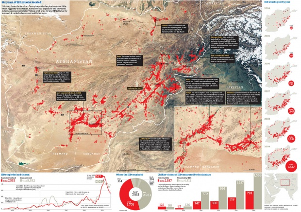
Of the case studies that I read and analyzed, the one I found to be the most interesting was Data in the News: Wikileaks. Using spreadsheet data obtained from WikiLeaks war logs, The Guardian wanted to create an informative infographic on six years of IED attacks in Afghanistan. Taking the incredibly long spreadsheet (comprised of 92,000 rows), journalists at The Guardian used a map of Afghanistan and surrounding territories to display where IED attacks took place. This infographic succeeds as a visual aid because it shows the viewers of the infographic where the attacks took place and how many there were.
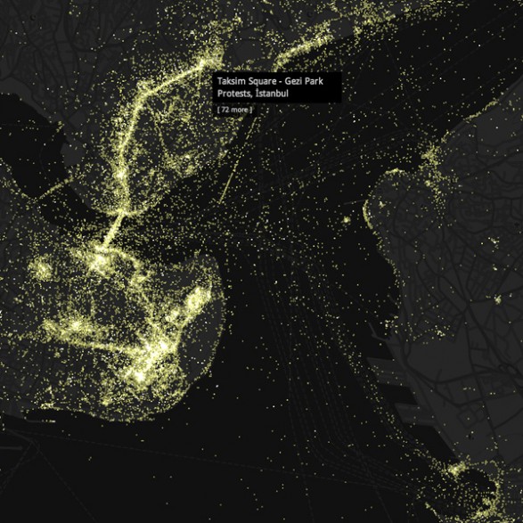
Wikipedia Worldview
Making use of a point map, Wikipedia Worldview, is capable of displaying points on a world map where information is being recorded and posted online. It allows users to see where the most high density information posting is occurring. This is valuable to see which specific areas on the planet are posting the most information and data on Wikipedia. It’s also very visually appealing to readers.

Luminous Cities
Luminous Cities allows users to view photos of Flickr users. Each dot, which can be colored to the specific country and region, is a Flickr user with photographs to view. The maps are both beautiful and interactive, and can be used by journalists to view photographs that they find relevant.