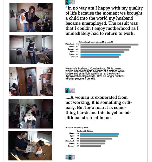
Out of all of the case studies in our recent Data Journalism Handbook chapter, I particularly liked The Eurozone Meltdown study. Being someone one with more of a traditional journalism background than data journalism, I am always interested in a good story and in finding the best story. I really liked how the journalists and coders not only took the time to get the best data they could, but also took the time to find the best stories they could to pair with that data.
They sent out specialized journalists to find specific stories to fit the type of data they had and then used the data to supplement those stories, keeping the story at the center of the project. By taking a more traditional media approach in addition to the data journalism, they were able to put a face to all the data.
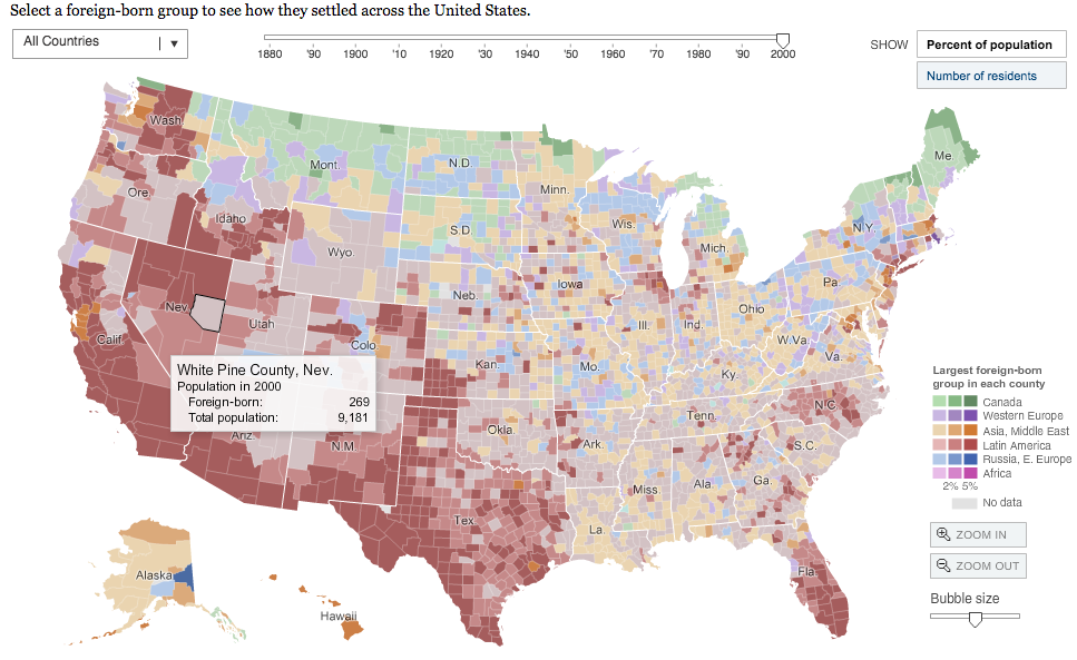
Another one of my favorite examples of data journalism is the New York Times Remade in America Immigration Explorer. I cant even imagine the massive amounts of data they had to sift through to be able to put this together and I admire the creativity to give a new perspective on an ever-present topic. I also like how the project has many different interactive layers.
I love the project by Gapminder titled Wealth and Health of Nations. First of all, it’s just really cool to watch. Kudos to the people who designed it because it is very creative and intriguing. I like how you can change the view of the background as well, giving you a completely different perspective. This is the kind of data journalism that clearly tells a story in a creative and fun way.
