Working with charts has been one of my favorite projects thus far. I think it’s because we are getting into the nitty gritty of data and there is a lot you can do and learn.
The first chart I worked on was through Google Fusion Tables. I created an interactive bar graph using data of the 2012 EMS Transports in Austin, which I am planning on using in my final project. I tried to embed the chart into the post but it needed a plug in so a screenshot and link are provided.

I also worked with pie and bar charts in Chart.js. My pie chart is a great example of why pie charts rarely work because the slices aren’t varied enough but I really liked the pie chart graphic and wanted to see how it worked. The line chart is a much better representation of EMS transports per month.
I also worked with the Google API to create a chart with the same data. I really liked the options that the API has available but I’m still learning how to use some of the more in depth functions. If I can figure out where my mistakes are I can definitely see myself using it in my final project.
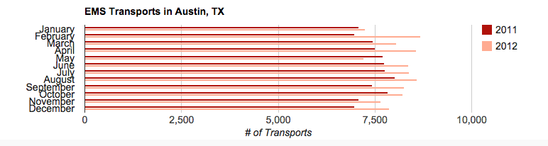
In my Highcharts example I incorporated more EMS transport data from 2011 and 2013 to give the chart more depth. What I particularly liked about this tool was how interactive it was. You can choose what year you want to look at specifically or view all years at the same time.
Final Project
As far as my final project idea goes, I will be answering the following question: Does the growth of SXSW positively correlate with a rise in crime in Austin during the month of March?
I am currently in the process of collecting and cleaning up data. I have crime data for the past 10 years as well as EMS Transport data, some of which is pictured above, and I am in the process of collecting SXSW growth data. Below is a sketch of what the website will look like.

I would like my project to integrate both copy and data visualization to tell the story. The story will start out with general SXSW growth data to give the user a foundational understanding of how large SXSW has become. Following that will be a short piece of copy discussing the recent negativity the festival has received with maybe some quotes from Austin natives and festival goers.
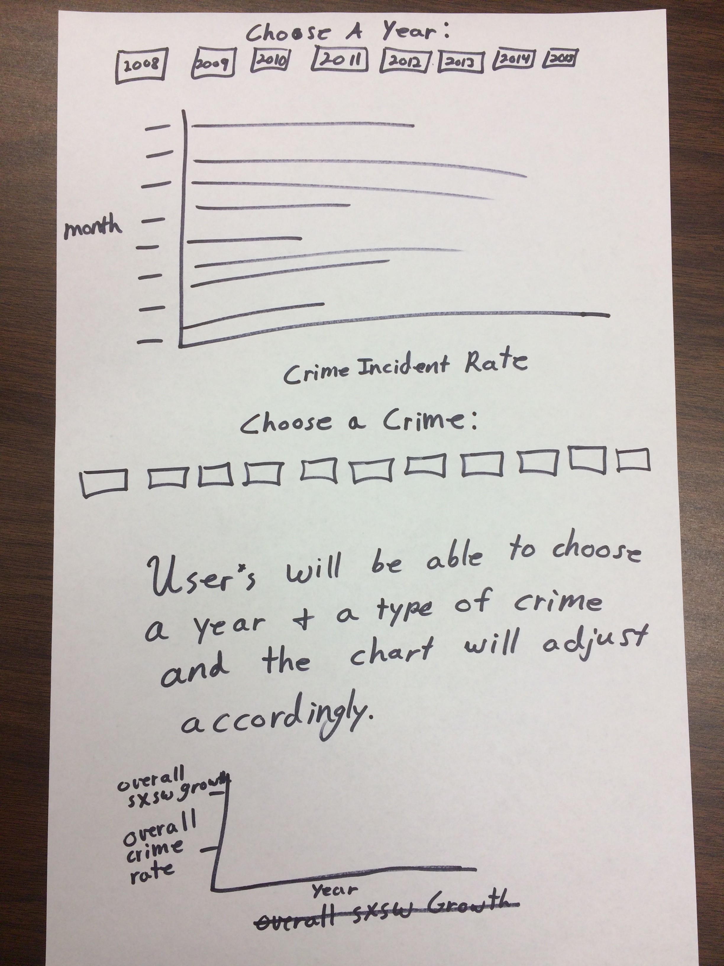
I will then provide a bar graph where users can choose the year and then crime data will pop up for that year separated by month. They will also be able to view all crime rates for all years being covered on the same chart.
Another chart (Not pictured) will allow users to choose a specific type of crime and see the rates for that based on all years being covered in the story. An example of a type of crime would be parking violations.
The end of the project will then show a chart featuring SXSW growth data and crime rate data to show the relationship between the two.