Hello Class!
For the Charting exercises I chose to work with SXSW Attendance as my data. The numbers came from the Official SXSW Statistics that they post every year after the festival.
I made my charts on all three platforms from the video.
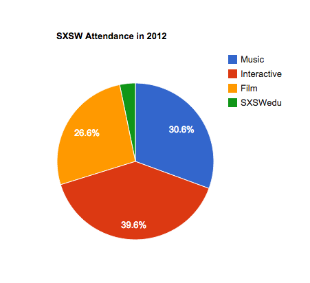
For Google Charts I actually made three different pie charts to show the attendance of each part as a percentage of the festival as a whole. Through the years you can see the percentages slightly changing as the interactive section of the festival gets bigger, but also you can see that all four section are growing together almost because the percentages stay relatively similar.
HighCharts was the next platform I used to make a bar chart this time.
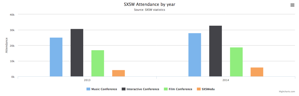
I used data from 2013 and 2014 to make a bar chart comparing the attendance for each year. I think the data is understandable, but I wish I had figured out how to make a double bar chart instead of two like this one turned out. The mouseover key is really annoying in my opinion because it takes away from the chart itself and doesn’t allow you to look at the numbers while looking at the chart because it’s so big.
Finally, I had some trouble with charts.js. I felt the bar chart I made was good but when I attempted to change things on it I managed to somehow break it and my chart no longer shows up 🙁