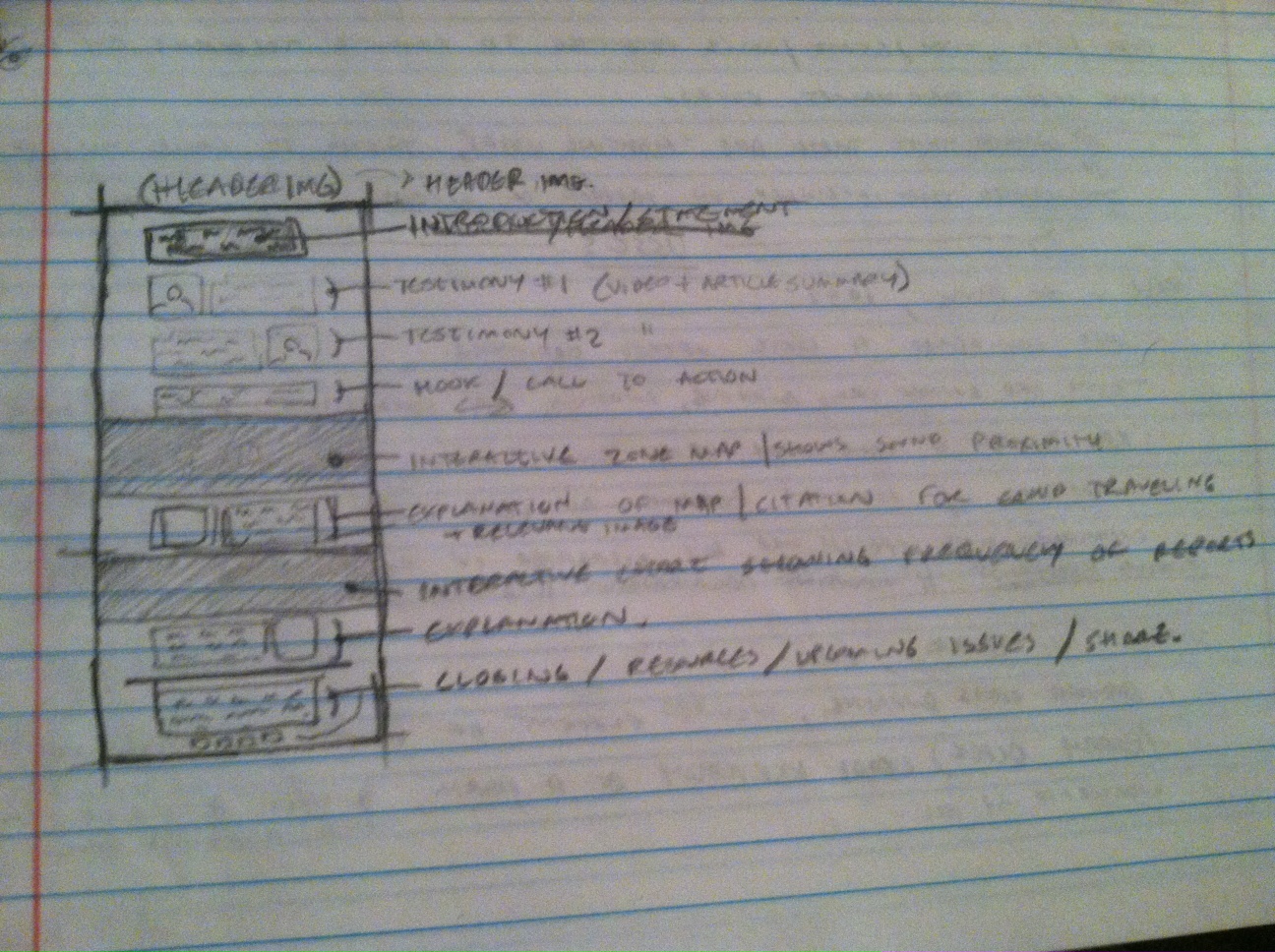
My apologies for the quality of the sketch and the photograph- likewise, I’m certain that my handwriting is sure to cause further confusion. I’ll use this space to elaborate on the components of our website. Interactive elements are listed in BLUE TEXT. From top to bottom, the page will contain …
- A snappy header image / tagline. Something flashy like, “Sound pollution and you!” (probably better)
- An introductory paragraph, only a couple of sentences introducing people to the problem. This paragraph will contain audio files via soundcite that will allow people to get an impression of what the noise sounds like for the people living on Red River.
- Transition into a video and paragraph of our first testimonial. Either a business owner or resident in the area and how they feel about the development and noise ordinences.
- Immediately following that, a second testimonial of a contrasting view.
- Beneath that, small paragraph with a short hook and/or call to action. How far does the sound really travel?
- Then, an interactive map containing the approximate perimeter of the sound traveling out from the venues.
- Following that, an explanation relaying what the map visualizes.
- Beneath that, an interactive chart or graph containing report rates for sound violations in the area.
- Again, another brief explanation beneath that data explaining it in simple terms.
- Finally, a short closing paragraph with important information such as resources to report sound violations, further information, and details regarding potential opportunities to voice concerns to the city of Austin on this subject.
- Cap the page with social media buttons to share / reblog this page.
This is what we’re starting with! Things are bound to change, but we’ve got our work cut out for us to deliver an amazing piece on the problem of sound pollution on Red River.
Sketch: Sound Pollution on Red River