Google has done it again! Whether it is producing heartwrenching television commercials or creating incredible charting tools, I’m never ceased to be amazed. Along with all of their other great tools, they have ways to make all sorts of powerful charts.How great is it that all you have to do is upload a file to Google Drive, let it process the information, then allow you to create customizable visuals. I honestly was unaware of how much you can do with Google and how easy they make it!
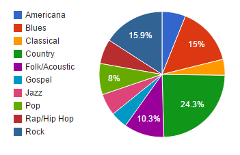 Here are two examples of charts that I created using data scraped from the Texas Music Office. The first visual is a pie chart that represents the number of bands that are in the top 10 genres. The genre with the most bands is Country with 1208 bands. The 10th most common genre is Classical with 205 bands in that genre.
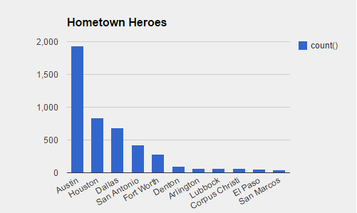
My second chart is a simple representation of the top 11 cities where the most bands are located. It comes as no surprise that Austin, the capital live music, has the most bands with nearly 2,000. Following Austin are the other top cities in Texas: Houston, Dallas, and San Antonio. I was happy to see that San Marcos nearly made it in the top ten!
As great as these charts are, one of the only things I did not like about working with these charts was that I could not figure out how edit the chart once I clicked “done”. I’m sure there was a way, but I didn’t have enough time to try to figure it out. Other than that, I thought these fusion tables were great and will definitely keep them in mind in the future when I need to create charts!