Each city has a beat. a pulse if you will, and each pulse draws a specific music genre.
Using a Bootstrap template, I am going to design a multiple page website in order to tell the story of a city’s pulse, looking at the major cities of Texas, Austin, Dallas, Fort Worth and San Antonio. The front page will provide a peek into what is inside, and look a little like this… 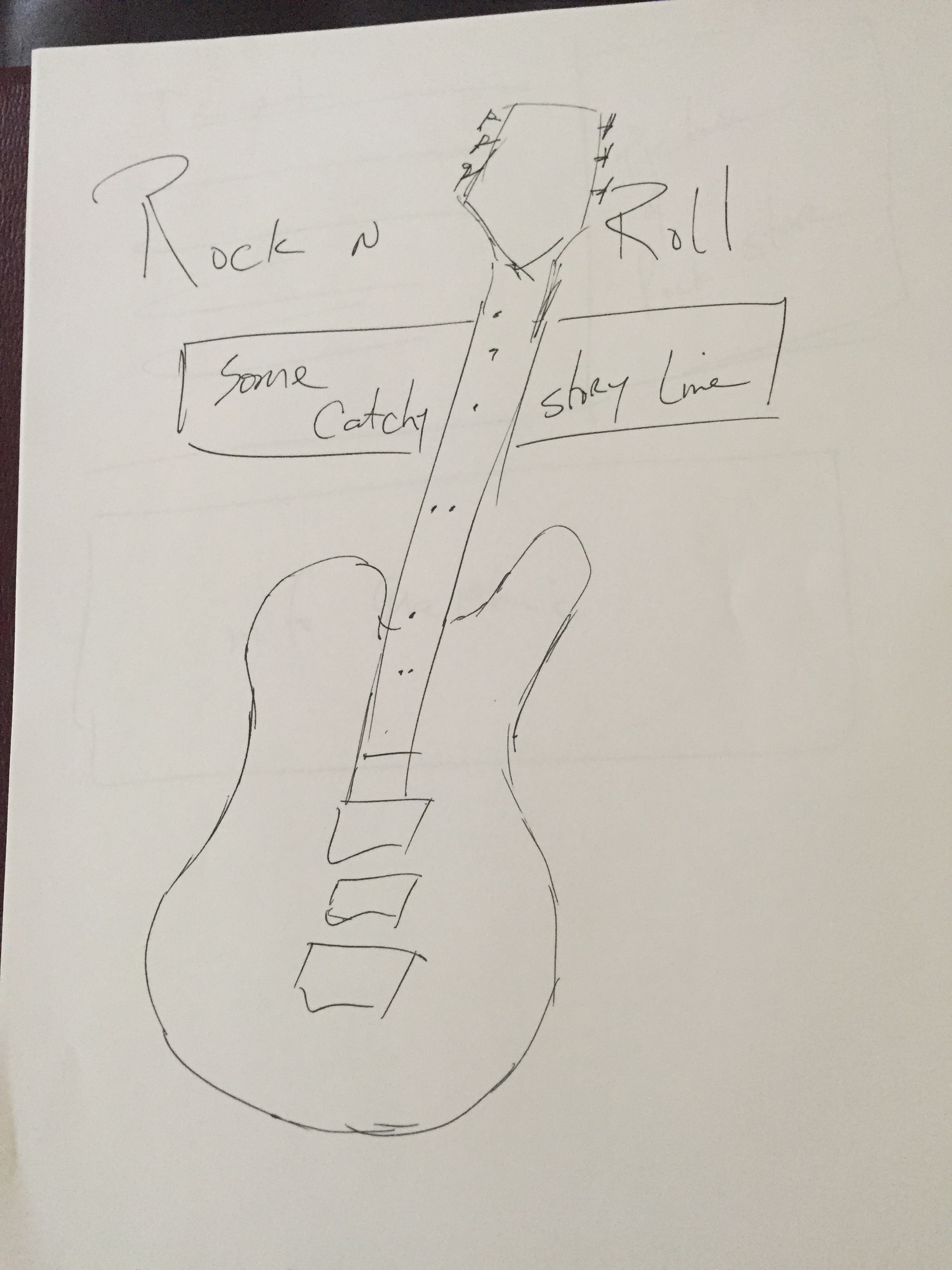
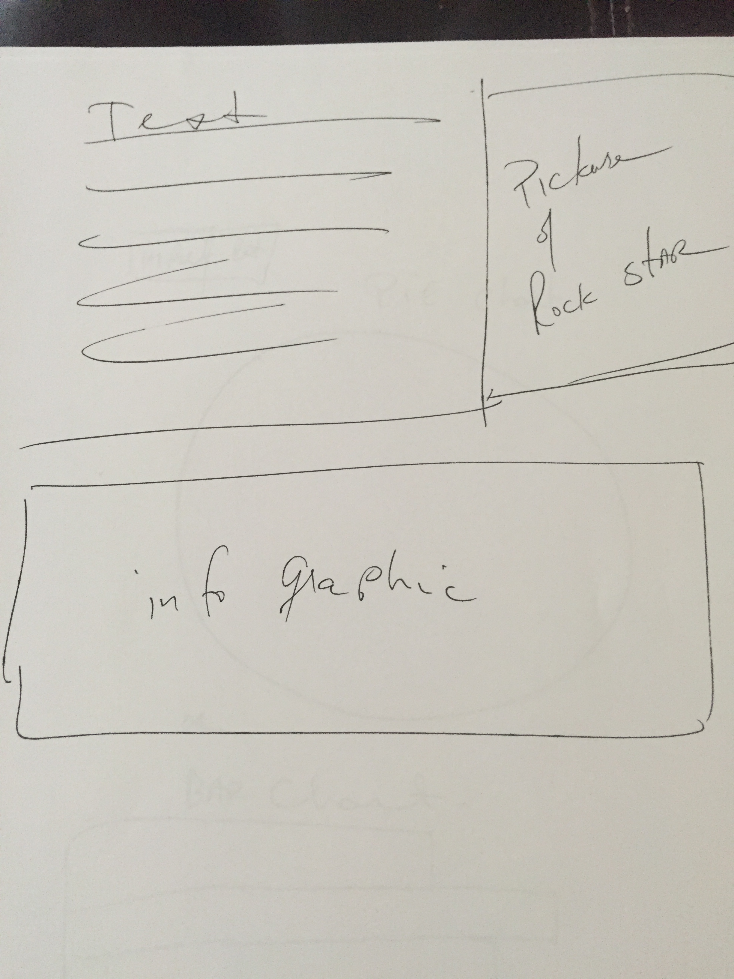
The second page will be a mix of story and images from the top ten artists in each genre beginning with now and moving backwards by Decades and as you change the decade, the data will correspond and change the images as well. The second page will look a bit like this,
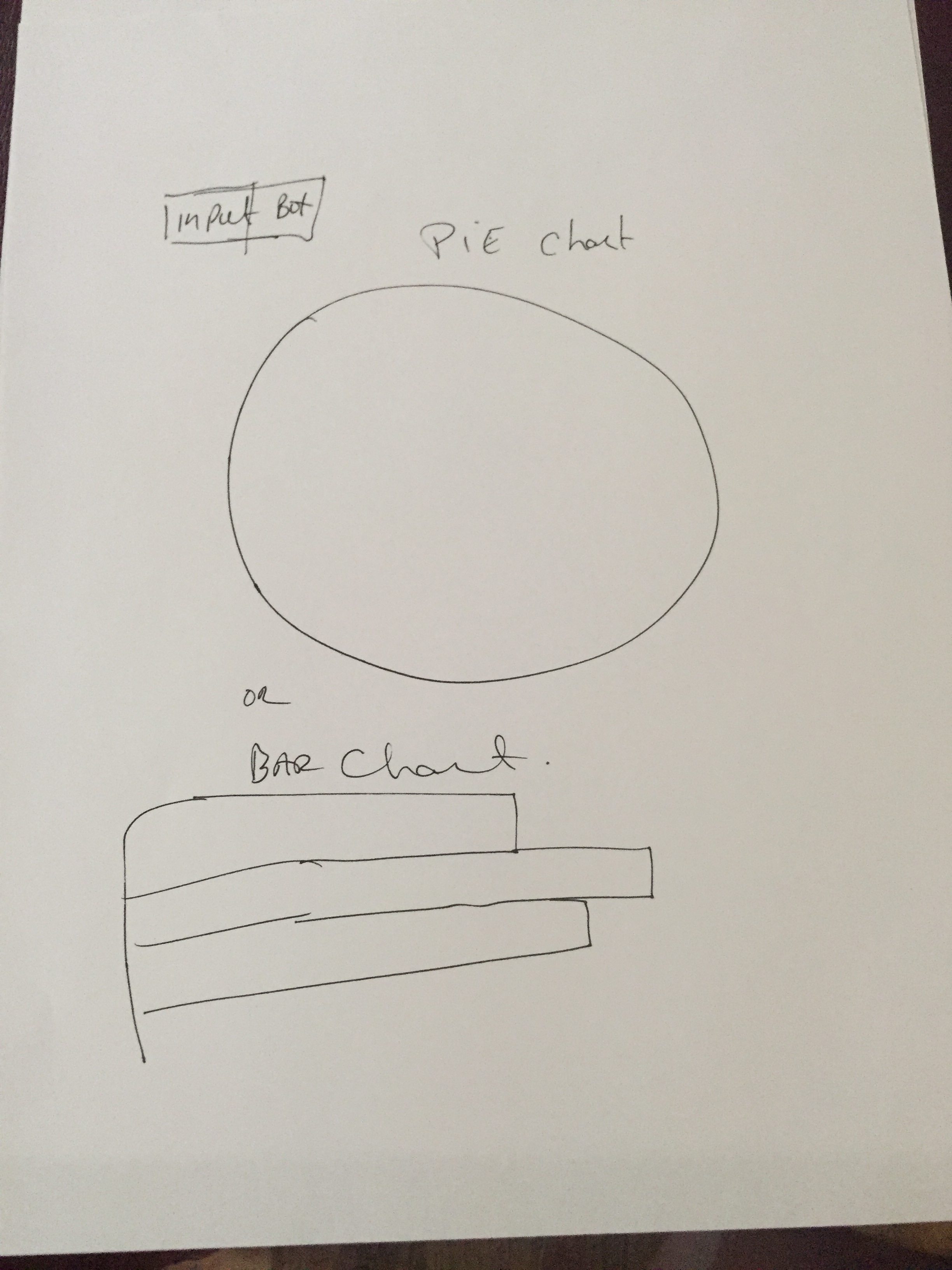
the final page will be the data page with the charts, I am not sure I want to use a pie chart or a bar chart but that detail will work itself out once the data is in place and I check to see which has more impact, a slider bar chart or a pie chart.
so the final page should look like this….
Wish me luck……….
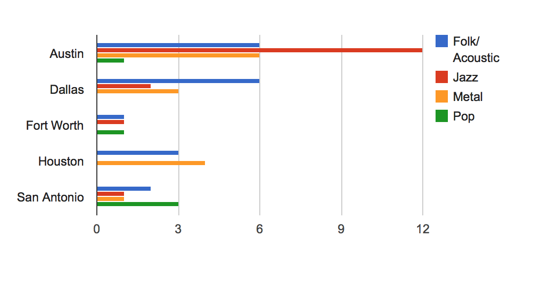
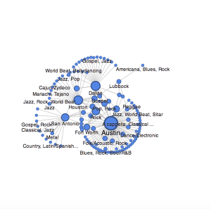
Utilizing the charting tools, I envision it looking like this
or this
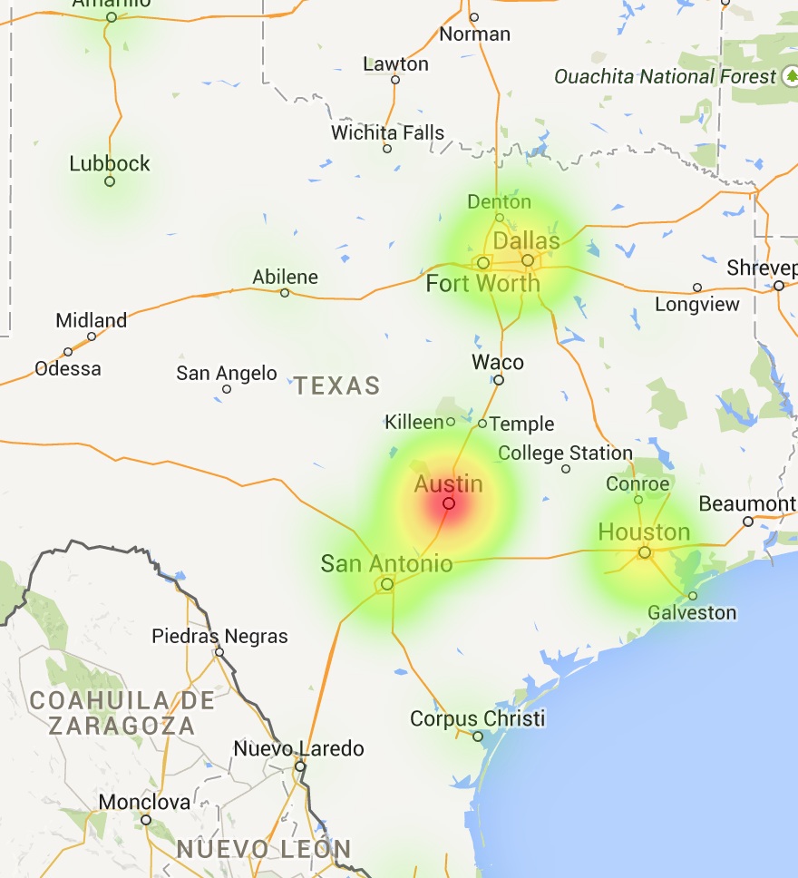
Utilizing Google Fusion Chart it just may look like this