As other people have noted, the largest takeaway from the Delivering Data chapter is the need to deliver data quickly, clearly, and with a concise story. I think that what Scott Klein had to say about news apps was very relevant. The people in this class that have posted their favorite data journalism stories often include a news app portion to it. Adding interactivity to data is a great way to keep people’s very limited attention spans.
I also liked what Sarah Cohen (even if she is from Duke) had to say about data visualizations and how they’re effective because they tap into the half of our brain that processes visuals. And that data viz “offers the tantalising opportunity for storytelling that is above all driven by facts, not fanaticism.” That’s exactly how I feel about good data journalism.
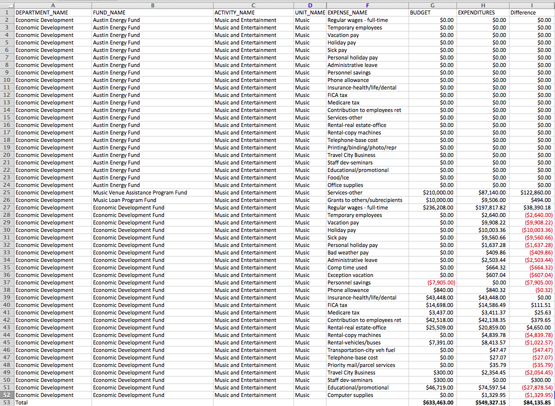
I found the City of Austin operating budget which has all expenses both budgeted and actual expenditures. Part of this data set, which I have sorted down to, includes music and entertainment expenditures. This allows us to see where the city is allotting funds for music and entertainment, and where the actual expenditures are happening.
Other data sets that might be useful are the comptroller’s tax files and the festival permitting application data set. The tax files include the mixed beverage receipts and hotel occupancy tax, while the permitting application shows what venues applied for festival permits and whether or not it was SXSW related. Although the permitting data might not be useful on its own, it could be paired with the beverage sales to see what venues had increases in sales after applying for a permit.