The Delivering Data chapter of the Data Journalism Handbook made some interesting points that I hadn’t truly thought about in terms of making your data available and prioritizing data projects.
As someone with a design focus I normally think more about how to clearly portray something or finding the best fit between story and visualization. This week I really realized that making the data that you use to build your graphics openly available is another form of journalistic integrity and transparency. Not only does it allow others to check your work – a sometimes frustrating but totally necessary step – it can generate further stories.
The Seattle Times summed up this sentiment for me.
“We are showing the readers the same data that we used to draw powerful conclusions. And who uses it? Our critics for sure, as well as those just interested in the story and all of its ramifications. By making the data available we also can enlist tips from these same critics and general readers on what we may have missed and what more we could explore.”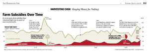
Another point I found powerful was the idea of mocking up a visualization of your data early on to guide your story. The visual hills and valleys in a chart can trigger the curiosity necessary to ask, “What happened here? Why is this different?”
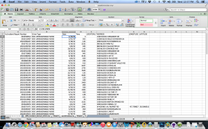
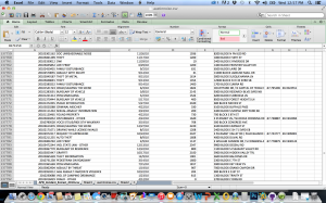 For our final project: Several related data sets I found that could be useful are the Austin Police Department‘s Incident Extracts. I found examples from 2008-2011.
From these datasets I was able to isolate and extract all instances of violations for excessive noise that were listed.
We would have to further narrow down which complaints are venue-related, which is possible, but somewhat time-consuming, because all addresses are listed.
 Using this isolated data we could coordinate with housing information, especially information on new builds or neighborhoods where a lot of population growth is taking place, to see how the changing housing situation in Austin is affecting noise complaints related to the music scene.
While this data could be charted in terms of how many incidents took place per month – I think the better visualization would be a heat map or point map were incidents are charted over an illustration of the city to show what areas are seeing the largest number of complaints.
The story could also be how noise complaints and housing prices interact – are high-cost neighborhoods more likely to complain than affordable ones? This tangentially becomes a question of how gentrification of neighborhoods might affect the music scene.