Wikileaks war logs
One of the greatest benefits and loftiest goals of data visualizations are that they make clear issues or events that can be overwhelming or difficult to understand.
Nothing can be more overwhelming or difficult to grasp for the average citizen than the realities and intricacies of war. For this reason I was really drawn to the Wikileaks war log case study. 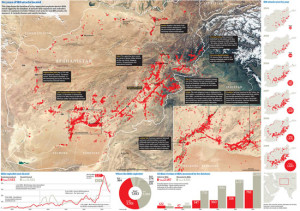
In the case study, thousands of rows of data were uploaded to a searchable database from which reporters could access different key words in order to track trends or events that took place during the war in Afghanistan.
This map, created by the Guardian, analyzed data on the roughly 7,500 IED (Improvised Explosive Device) attacks that took place between 2004 and 2009.
Read more about how the Guardian handled the flood of Wikileaks data here.
Time and time again we hear, in studying data journlism, that a picture is worth a thousand words – but an interactive, informative graphic based on data is worth a million.
So much information about the military campaigns that took place in Afghanistan and Iraq was not available to the public. And what was was often so confusing that it bordered on meaningless. Everyone heard about IEDs, but this map made the truth of how many explosions troops were facing and the consequences of such ambushes understandable.
LGBT rights around the world
When things seem remote and information is scarce or spotty it can be easy to forget or devalue struggles taking place in other parts of the world.
While we have been abs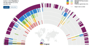 orbed in our own LGBT rights movement here at home, many countries have been involved in similar internal strife. Many of those countries’ LGBT citizens face difficulty and danger far greater than our own – death penalties are a reality in several countries.
Without a way of making these struggles clear and stark, the international community is less likely to step in and try to help.
The Guardian again stepped up and created an amazing interactive infographic where users could scroll over different countries to see the state of LGBT rights in those countries. Click on the image to see the Guardian’s fully interactive graphic and explanation.
Latino Healthcare Enrollment
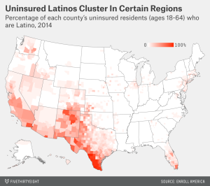
The third infographic I found really relevant and interesting was one created by FiveThirtyEight.com, a website specializing in data driven journalism, which illustrated the number of uninsured Latinos in the US.
The graphic looks at what percentage of an area’s uninsured population is made up of Latino and Hispanic residents.
This is one of the largest demographic groups in the US at this time. The fact that in certain areas almost 100% of the uninsured population is Latino means there’s been a disconnect in reaching this group with healthcare and insurance information.
Living in San Antonio, with a majority Latino population, I know that this means that so much of the city is unprotected in terms of their healthcare costs.
These visualizations help quickly explain complex issues in ways that are so much more memorable than blocks of text. If they succeed not only on an informational level but also on a design one, people will not only be interested – they will tell others to check it out. It shows that making your stories clear and providing easy-to-understand context really will pull in readers.