The major thing I took away from the chapter was when it talked about using data visualization to tell stories and gave examples of when it is appropriate to use data visualization. One of the first things listed was to show change over time. We have talked about how data vis. can be important to tell stories and possibly make it easier for the reader. Showing how something has changed over time is actually the perfect example of how this can be easier for the reader to understand. I searched for an example and came across an example from the Pew Research Center about “The Next America“. This data visualization set is excellently designed and gives amazing examples of 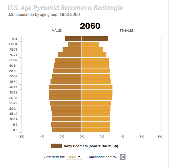 what charts and graphs can show to the reader. The one that caught my eye was a graph that shows the percent of the US population by age groups over time. This is also a great example of how data visualization presents data in a meaningful way. You will have to go to the website to see it in action, but the graph shows the baby boomers consistently being a large population in the United States due to higher life expectancy and by 2060 the chart almost becomes a rectangle, meaning there are just as many senior citizens as their are elementary schoolers.
This got me to think that I would like to incorporate time into my project, if at all possible. I am still hoping to do my first idea about adopting animals and am thinking about how to incorporate time into that subject. I could possible show how many animals are killed every year because of lack of adoption. My second idea, my more boring of the two, would incorporate time all by itself because it would be comparing old revenue to the new revenue that is being generated at my job. Again, like I said, boring.
The chapter and the data visualization sets that I looked up did inspire me to dig deeper into what I can do with the story I want to tell. Finding the data and showing it to others in a way that would help readers make sense of it is very important especially with the topic of opting to adopt shelter animals. It is still a work in progress for me but looking at other examples like the Pew Research example have really helped me think outside the box.