I actually had a lot of fun making the graphs for this project even though it was a little challenging at first. In my head charts need to be related to numbers in some way so I used spreadsheets from my work as my data set. It’s also kind of like killing two birds with one stone since I have to review the numbers anyways.
My Chart.js chart is a line graph that shows the comparison of last years budget made to this years budget made. I used the two line graph so that way you could see the difference side by side over time. I thought this would look nicer than just two bars next to each other. The lines show how close or far the budgets were away from each other from the previous year. The pros of chart.js is that it gives you all the information you need to code the charts and is easy to use and figure out. They also have a clean modern look that can go with any site. The con is that there isn’t the js.fiddle option in charts.js, which I found to be very helpful in the other options that were given.

My highchart is a bar graph that shows how much revenue, if any, my site made each week out of the quarter. I chose a bar graph because the high charts had an option to show negative numbers in this specific graph, which I needed because I lost money two of the weeks in the quarter. The pros to this is that I was able to put in negative numbers and I was able to use js.fiddle, which helped out a lot to see what was changing in the chart. The con for me is that I had to really look at the data before hand to see how it was coded before adding or putting my information in, there isn’t too much explanation.
My google chart is a pie chart that shows how much each site in the district contributed to the district budget made. I did this so that everyone in the district could be represented and shown how much they make up of the entire budget that was made for the quarter. The pros are that there are several options, js.fiddle is available, and there are explanations throughout each chart and graph. The cons to my chart personally is that I didn’t really think of a way for this to be more interactive or more interesting than just numbers on a page.
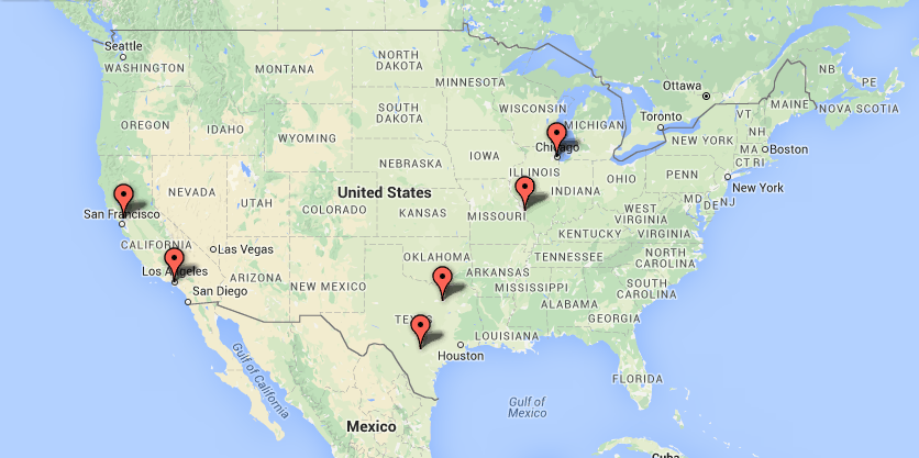 My google fusion chart is a map of where each district is located. I used a spreadsheet that had each location on it and was able to put it through google fusion to receive the locations on the map. I then screenshot it to be able to put it in as an image. The pro to this is that I was able to show all locations of each site in the district at once. The con is that it was a screenshot and is not as interactive as I would like it to be.
I definitely see more clearly how this can help tell a story and why data visualization is important and can be very beneficial. I personally think that what I struggle with is the creative part of data visualization. There are all these amazing tools and resources to help, it is just finding out what you really want to tell the story about and translating through the data that is the tricky part, in my opinion.