
Twitch is a universe which only a select few people really know about. And what you use it for, depends upon the user. It’s a strange world actually. People from all over the world gather to wacth someone play a video game. Personally, it’s my favorite social media! For this project, I took the twitch api to find the top 25 streamers, and used that data to create charts that all together, create a story about these top streamers.
 My first chart uses HighCharts. This chart causes me the most grief….HOWEVER, it’s totally fine. With a lot of research and a lot of work, I got it to pull live data from Twitch. However, for some reason, that makes the chart only work sometimes. There’s a bug in there and I can’t seem to figure out what it is *cries as she slowly fades away*. BUT ITS FINE! Totally fine…..so fine. Yeah. It’s fine. The chart’s purpose is to show the top 25 streamers that are live at this very second. It’s based off current viewers, but I’d like to integrated followers as well in the future.
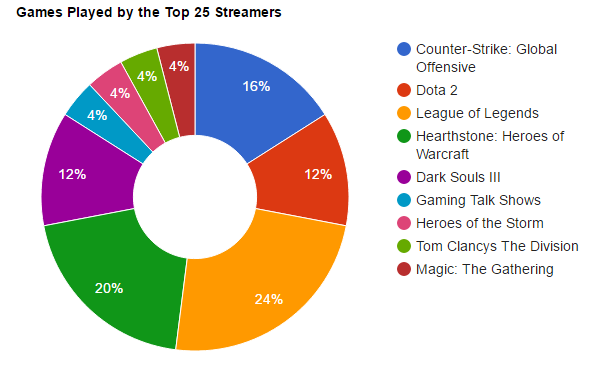
My second chart uses Google Charts and shows which games top streamers play. This one, doesn’t pull live data, but I will get it to do so, in the future. My third chart uses Chart.JS and won’t be able to be a live feed of data. I had to do my own research for this one because gender is not revealed in Twitch API. Perhaps for my final project, I’ll scrape twitch profiles to try and make it for all around twitch users: Male, Female, Company or Unknown. And my last chart uses Fusion Tables. I couldn’t get the gradient to work so I thought I’d explain it.
On the map I have little red dots and if you click on them it shows a streamers username that streams from that country. To gather this data, I had to do a lot of my own research as well because Twitch API only gives the language of the stream. But you can speak English and be from almost anywhere. So I went to the top 25 streamers of a certain point and time and found out (to the best of my ability) where they were from. After doing so, I created two tables. One table had each streamer and their country, the other table had each country and the number of streamers from said country. Example: Streamer A is from Scotland. Streamer B is from Scotland; there are 2 streamers from Scotland. I want to try and make this where it covers all streamers, not just the top 25, but I’ll probably have to scrape profiles for that data. I also want to figure out why the gradient effect wouldn’t work even after I merged the two tables.