As we were assigned, I have been playing with various charting tools using the data I will be using for the final project. I made a practice site to try to embed multiple visualizations on one page. Each of the tools was generally easy to use, but there were some things I initially wanted to accomplish in some of the tools that I was unable to.
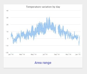
Highcharts was, as I said, largely easy to use when it came to the pie chart that I used. I know there is a very real anti-pie chart chart floating around but it felt appropriate as I was using it to chart portions of a whole. I was initially interested in using the chart to the left but, unlike the pie chart, but they don’t provide you with a way to edit the X axis, Y axis or a few other key areas that I could find. The chart I ended up using was easy to edit. They made the info ready accessible and alterable. Once I was able to find a chart that was readily editable it was quite easy, though still came with a couple annoyances. There seems to be no way to make the menu in the top right corner disappear, and the same goes for the text in the bottom right that has the sites name.
Chartjs was likewise easy to use for its basic features. Some of the more advanced features are more tricky to figure out and the website doesn’t really give you any guidance. They list some lines of code with no context for where in the larger code they belong. They also have fewer chart options so I didn’t spend as much time working on this platform. I selected a bar chart from their inventory so I could see a different style of visualization of the same data as I used on Highcharts.
Google charts was definitely the easiest to use of the charting platforms I practiced. With Very intuitive, they seem to provide users with everything they need and they have a wide range of chart options available. I used another pie chart from their selection but I organized the data in a different way.
Fusion tables has a great interface and is a very powerful tool. For my purposes, however, it won’t create visuals that will be of particular use. What I mean, is that the mapping feature makes it quite difficult to drop a large quantity of pins with the information I have available. Therefore all I created for my website is a summary table that is a useful step in organizing my data to be more appealingly visualized differently later.
Based on my practice with these tools thus far I am decidedly persuaded by the capabilities of data visualization in journalism. While the initial method in which I organized the data doesn’t currently seem like the direction I want to take the story in, the visualizations I made would be incredibly potent if the data had told the story I initially thought it would. Especially the google chart I used that shows a deep disparity between the locations of Austin’s public art by median income.