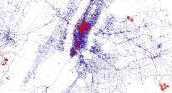
Upon reading Data Journalism’s How To Deliver Data one thing became clear: humans have an incredible short attention span. We can no longer receive visuals without loosing interests or just receive visuals without texts to engage us. Blame it on the zeitgeist, social media, etc but one thing is clear: if we want to deliver information we need the statistical visuals to back us up and a story to make it interesting. This has caused a paradigm shift in the manner which news sites deliver information. The New York Times, The Guardian and countless other websites have engaged in ways to keep the readers entertained.
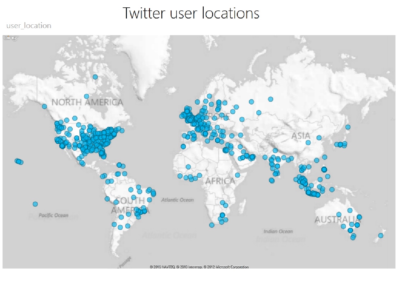
Not only is it important to keep the reader entertained but most of the time it is pivotal that the reader be aware of information happening in his/her city. The government is required to let its citizens be aware of information that belongs to the people, the only issue is that huge data sets are often difficult to understand and require a lot of digging. A data set on the City of Austin’s website gives the data for restaurant inspections across town. The data set, though intersting and necessary to read, causes the reader to loose interest and not dig forward. In contrast to KUT’s Noise complaint map. Informs the reader in a visual and engaging manner. After reading the Data Journalism chapter only pushed my drive in learning how to get the best data available. It’s exciting really, we live in a world where the gate keepers are loosing their power and it is our responsibility of passing the information along.
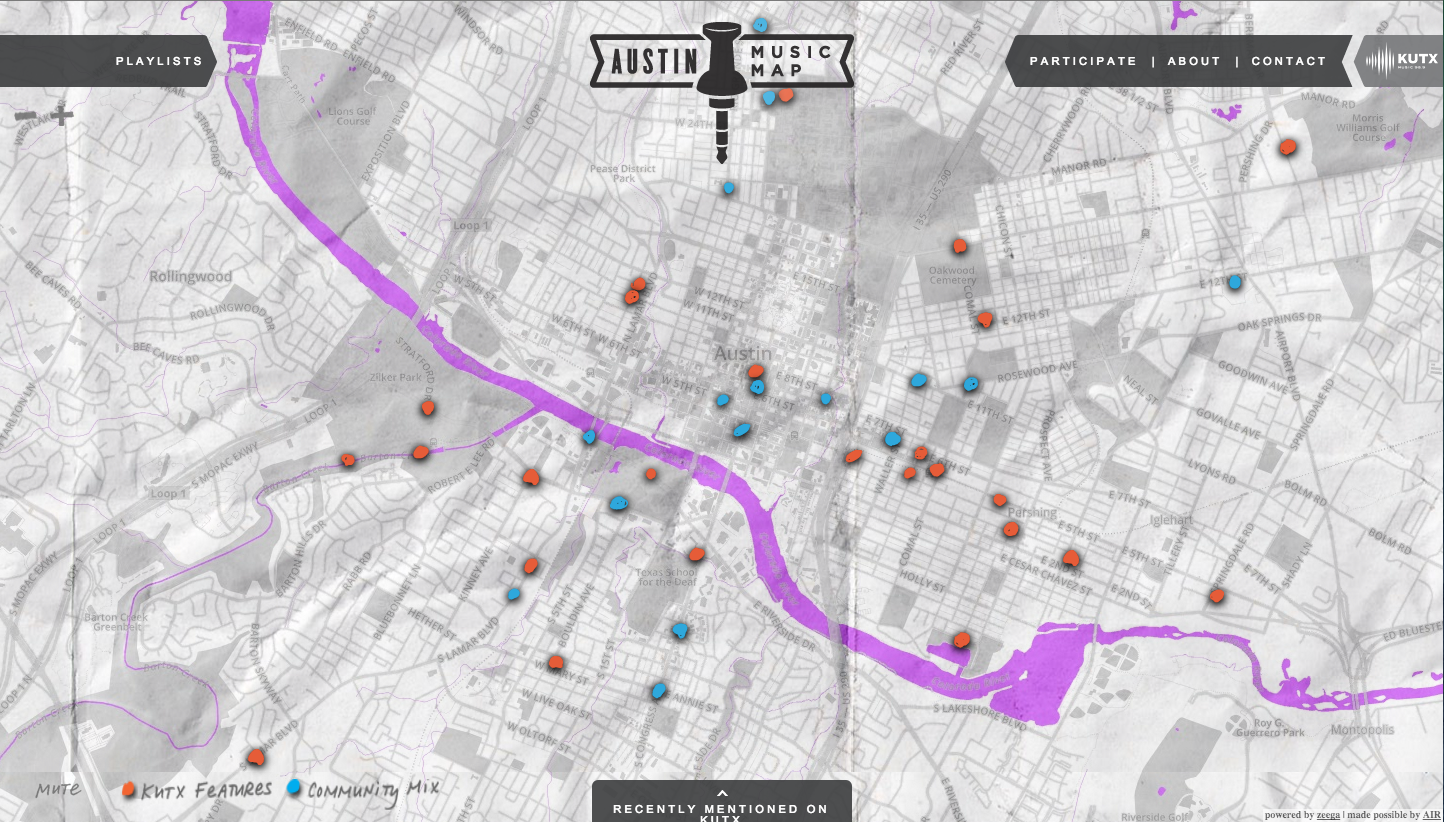
Finding new and exciting ways of delivering information is the responsibility of every journalist. I found the SXSW 2014 database will be a great asset to my future project by listing the strengths in the music industry in Austin.