By Melanie Morales
The two most interesting case studies to me were the Hospital Billing and Illinois Report Cards. The hospital billing, though prompted by a scam, could also be used to track illnesses and diagnosis in other ways as well to serve to the public. The layout on the page was user friendly as it changed when each tab was clicked. Those not well-versed in media jargon, like myself, could follow along fairly easily. I also found the Illinois Report Card example useful as I would personally use a tool like this. I like how the home page explained what it was and the different headings/areas the user might see. When searching for school, the tabs were interactive as well which allowed you to see what section you were on since the page could get very lengthy.
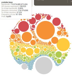 I found ProPublica’s How Much is a Limb Worth? data visualization very cool as you could search by state and by appendage, down to the thumb! It also compared what the state gave to the national average. It was interesting to see how some states gave more or less for the same body part. Palo Alto Network’s had an nice interactive for application bandwidth’s that went over my head for the most part. The user could sort by country and category type. I definitely encourage you to check it out! I had fun playing around with it.