I’m just going to dive right into this. In the case study the one that I found most interesting, and mainly because of the content to be honest, was The Tell-All Telephone. I’ve always been a little skeptical of the geolocation on my phone, especially when Siri started telling me it would take me “15 minutes to get to work if you leave right now” at about the time I would usually leave for work (even on my days off), pretty creepy. So this automatically caught my attention.
The way they show the data is spot on as well. The map is obviously the key to this so that way you can tell that your phone shows exactly where you are at exactly a certain time of day. I like that you can zoom in and out of the map, can control the speed of the days that go by, pick a certain month, and even see how he used is phone on a daily basis with the statistics on the side of the map. Honestly, it is pure genius and only perpetuates my fear of the geolocation, but let’s be honest, I don’t really do much besides Netflix, school, and work, so there is really nothing to fear in my case.
The other two data visualizations that I like are pretty different from each other. I wanted to find two separate examples instead of just posting about the same-ish thing. The first is a data set about Gun Control in D.C and the surrounding area. It uses a map and shows different colors to highlight areas of the most guns seized by police. When 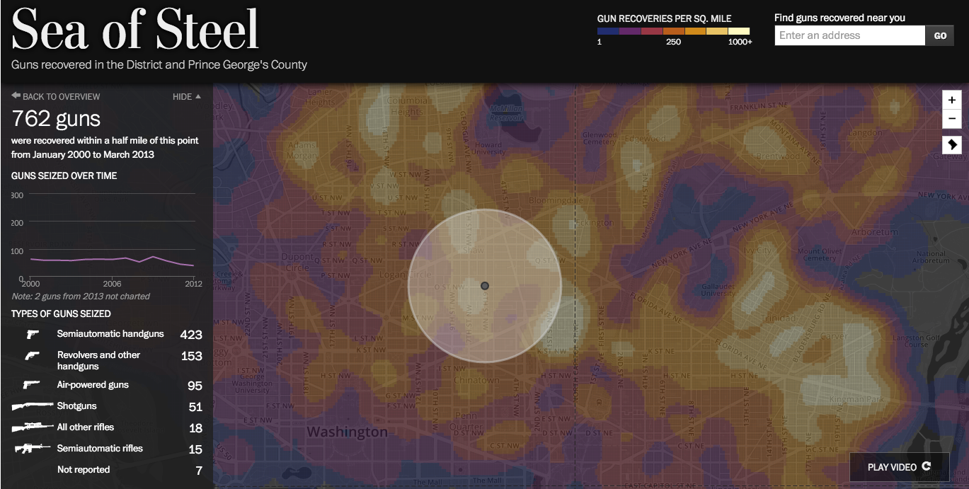 clicking a certain location, statistics pop up on the side to show you exactly what guns were seized and how many over time. At the bottom of the page, under the map, it gives more statistics that show the breakdown of the data, like what percentage of what kind of gun is seized, and so on.
I really liked this visualization because it is easy to use and gives you information along with the visualization. Yes, there is a map with pretty colors but what does it mean? Just click on a certain location and it tells you all the information down to how many assault rifles were seized in the radius of the location clicked.
The second data visualization is about the benefit of using a credit union over a big bank. This is interesting because it uses visualizations while telling a story. You can scroll through the story and facts come up about big banks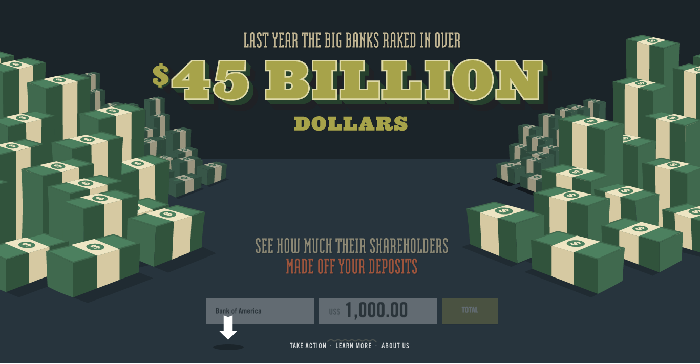 and where the money goes. Then it brings you to a page that lets you pick a big bank and how much money you deposit on a monthly basis. It then calculates how much profit goes to shareholders of that bank. It continues on to say that Credit Unions give the money back to the community instead of shareholders, helping out the everyday people. At the very end you can “take action” and gives more information about big banks vs credit unions
I like this because it was a story. You get to interact with the visualization on a more personal level and it still gives you valuable information about your finances. It does seem a little bit bias and doesn’t give a lot of information during the storytelling part but at the end it has all the information you would need and can go through on your own if you do decided to pick a credit union over another bank.