I found the Eurozone Meltdown to be one of the most interesting case studies that I read. It was hard to choose this one over Crowdsourcing the Price of Water since I found both arguments to be very fascinating. I easily related to the Eurozone Meltdown because my family was deeply effected when the recession hit in 2008. The story immediately tugged at my emotions and made me empathize with the families who were having to face the same hardships I did growing up. The story immediately humanized the issue they were trying to discuss. As for Crowdsourcing the Price of Water. I truly believe that was an amazing way to shed some light on a non-transparent system. I myself would love to see that done here in the United States with electric companies. I find it horrible that I can only use San Marcos utilities and not a competitor who can offer me a better rate or charge less during the winter months for “borrowed energy”. I would love to graph the rates and compare them to my actual usage versus the rates they are charging.
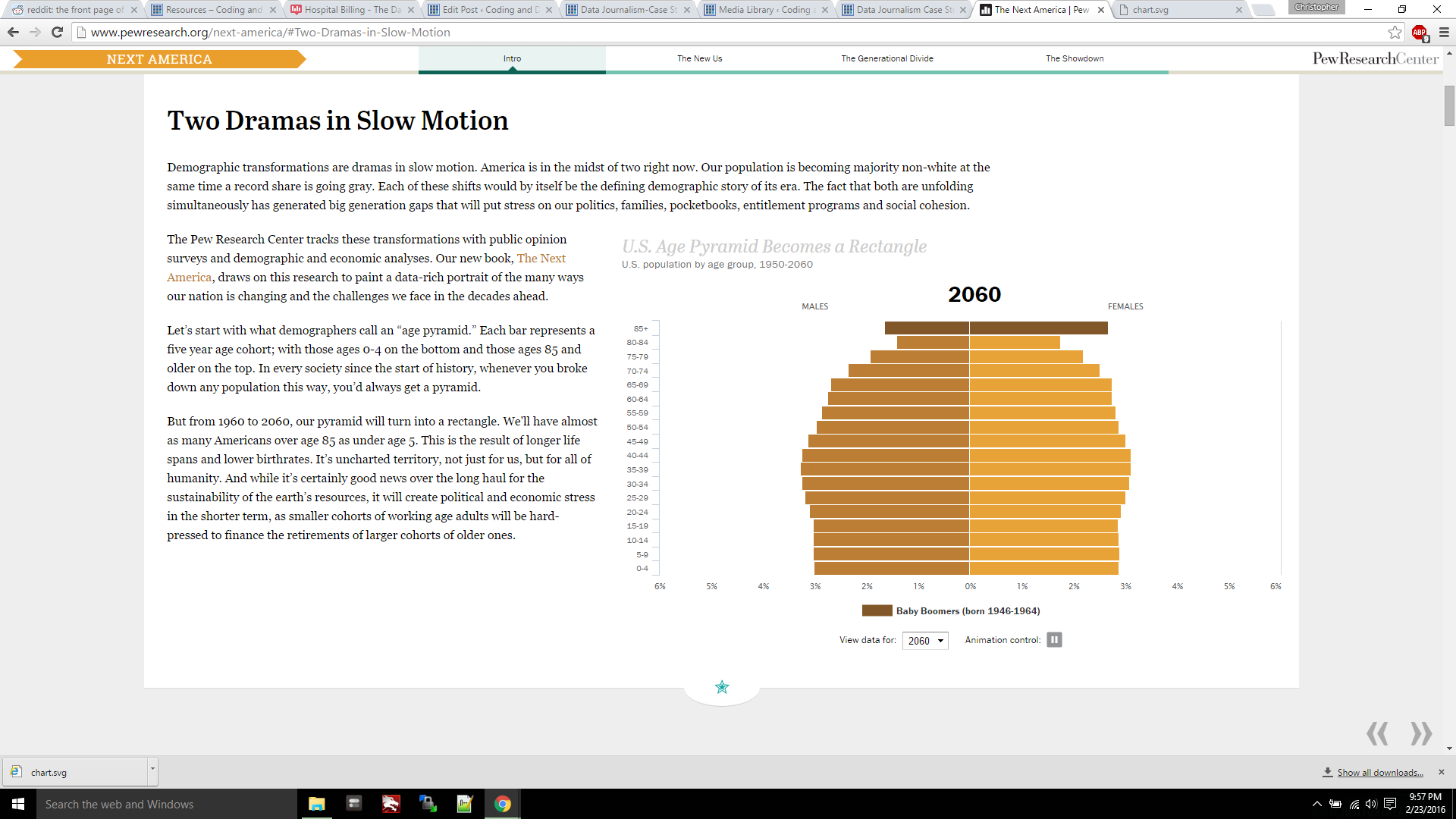
One of my favorite data visualizations is this multi-layered data set about the mortality rate in Wales, England. I find it interesting because you can see the correlations by cause of death in 4 different graphs. It’s a great way to study the way different cultures, lifestyles, and geography effect those rates. The other visualization being a proportional population trend for our national age population by pewresearch. The chart is responsive and shows that the population will box out. Leaving a more even number of the older generation to younger generation.
