From The Case Studies
The case study I was most interested in was the Hospital Billing case study. The data set analyzed the amount of up-coding that happened in Medicare billing. The reason why this interested me so much is because in Spring 2014 I took Health Communication Campaigns and one of the areas we discussed was crisis communication and the specific topic was Medicare overbilling.
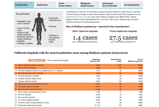
The dataset on this project was enormous: 4 million patient records over a span of 6 years. The journalists at CaliforniaWatch scanned for abnormal patterns in the dataset which were fairly easy to observe, one hospital had much higher incidences of malnutrition than other hospitals.
One of the standout diseases that were observed in this case study was Kwashiorkor. Kwashiorkor is a protein deficiency syndrome that is seen in starving infants in famine states in third world countries. In one hospital chain, Kwashiorkor was used as a diagnosis at rates up to 70 times higher than other California hospitals.
My Favorite DataStory #1
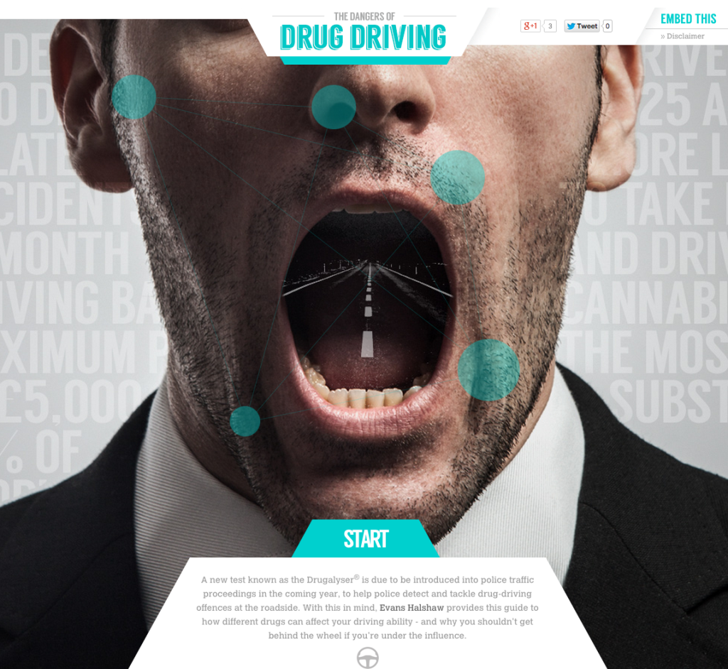
My favorite dataset is The Dangers of Drug Driving by UK Auto Dealer Evans Halshaw. The infographic shows viewers what it is like to drive with different drugs affecting your senses. The drugs showcased are Cannibis, cocaine, LSD, and ecstasy. The goal of this infographic is to highlight the dangers of “driving drugged” and how driving under the influence of illegal drugs is just as dangerous as driving drunk.
Since the producer of this infographic is a retailer and not a news source, this technically falls into PR. It’s great to see a company produce useful infographics that are newsworthy and impactful.
My Favorite DataStory #2
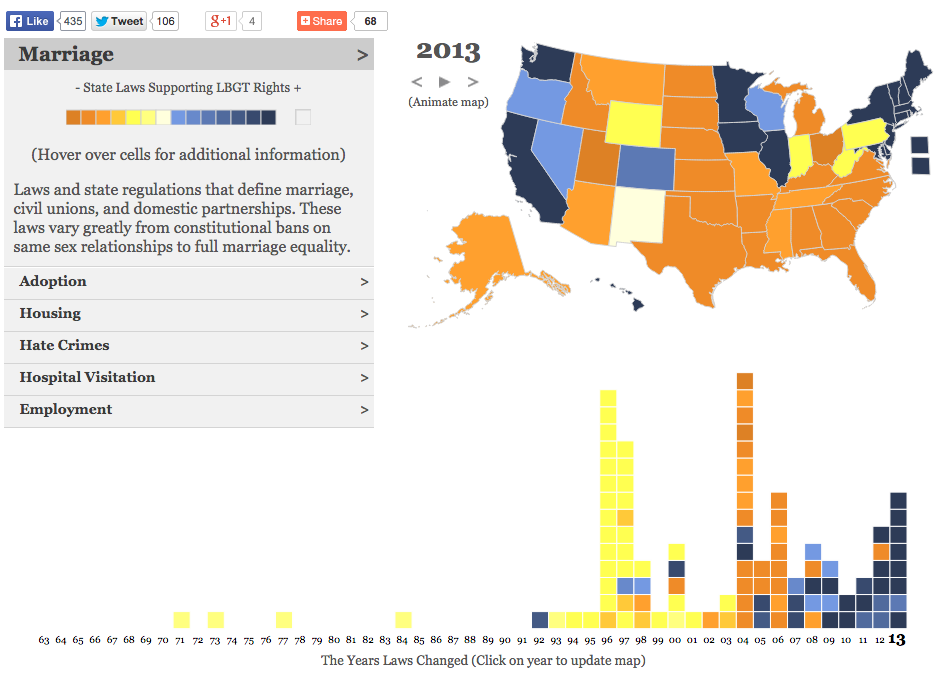
The “50 Years of Change” infographic created by Erin Hamilton, Rashauna Mead, and Vanessa Knoppke-Wetzel gives an interactive timeline of laws that restrict and extend LGBT rights in the United States. Each state is color-coded by the amount of laws that restrict of extent LGBT rights and then proceeds to break down the laws into six categories: marriage, adoption, housing, hate crimes, hospital visitation, and employment.
The infographic was last updated in Decemeber 2013, so while the information is outdated, it is still valuable at providing a historical context. I hope that with the impending Supreme Court hearing, they will update the infographic to include current information.