So a big topic being thrown around right now is whether our personal cell phones are as private as we would like to hope. Rumors that government is hacking into our phone calls and accessing our cameras so they can literally see what we are seeing. Whether this is true or not, I’m not the one to answer. But according to the research and study done by Maltze Spitz from the German green party, our cell phones can tell us everything about ourselves, from our habits and preferences to when we wake up and go to sleep. Scary stuff.
This research is insane. He obtained nearly 36,000 lines of data from his cell phone that reveals over 181 days of where he was, what he was doing, when he went to sleep, when he woke up, and more. It makes you think, “who could access this kind of information about me?” I love thinking that technology is becoming so advanced and so many new discoveries are being made but I frightens to me that people are using these technologies for the wrong reasons.
Going along with the topic of cell phones, take a look at this mind-blowing visual data chart about the usage of cell phones:

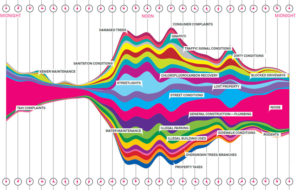
Another interactive data chart, completely irrelevant and different from cell phones, that I found to be interesting was one conducted by Junk Charts Trifecta Checkup. After collecting data from the City of New York 311, a distribution of what types of complaints callers had with the different times of the day they were called. For instance, most of the complaints about noise occurred around 11-12 p.m. There is not much about this data chart that is surprising (except maybe chloroflurocarbon recovery) but it’s still interesting nonetheless to see the data represented in that way.
So after realizing neither one of my infographics were “interactive” I thought I should probably include an interactive chart. After searching some really ones, I found one that caught my attention. The title of the chart is called “50 Problems in 50 Days.” It’s basically this guy going around Europe solving common day problems, one problem per day, and coming up with solutions. You click on each different problem which then pops up a box with pictures and solutions. I thought about how we could incorporate this into our music project. We could say each city was a concert venue and when you clicked on it, a top favorite artist that has performed there can show up. You can check out the interactivity of this data chart by clicking the image. 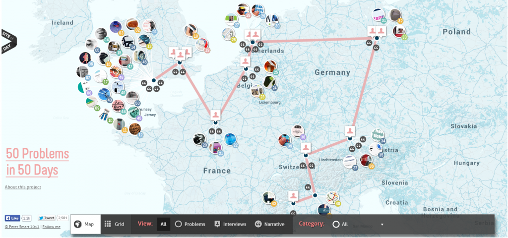
Harrissssssonnnnnnnnnn
Thinking about the infographic you’ve shared, I can’t help but want to point you towards this. It’s like, an infographic on super-crack. It’s interactive, enthralling, and drop-dead gorgeous. Check it out.
Cheers,
J