My favorite out of all these studies was the data of German politician Malte Spitz’s life during the campaign in Berlin. Spitz sued Deutsche Telekom and received 35,831 rows of mobile data from over a six month period. When combined, this data creates a window into a person’s life. In this case, it showed information such as where Spitz was, what transport he used, the calls he made, the messages he received and duration of his internet connections. Such data helps investigative teams profile a person under observation. While Spitz’s profile creation was voluntary, he and Zeitz Online make a very good point about staying wary of one’s day-to-day actions.
It’s a scary thought to think that all of us can be mapped in a similar way, down to the number (and names) of calls, messages and personal locations. However, given all the political drama that occurs today, I think this might be the only way we could work our way into honest politics…or at least something close to it. Similarly, this type of story shows the public how important data privacy is, as well as perhaps discourages people from engaging in dishonest (possibly illegal) acts.
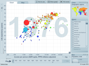
One of my all-time favorite data visualizations is the Gapminder, created in Stockholm in 2005. The website shows several sets of data cover a array of topics concerning sustainable global development. The visualizations consist of bubble charts that vary in size and position depending on the data on the x- or y-axis. Additonally, the bubbles move according to years that tick by on the graphs background. The data can be further manipulated by other controls on the chart, shown in the picture. The visualization is aesthetically simple, but uses color and shape in just the right places to accentuate its purpose and make it fun, engaging and informative. Hans Rosling puts the project to excellent use during his TED Talk about the rise of Asia in 2009.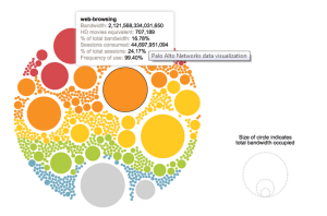
A second, honorable mention which is similar in shape usage was done by Palo Alto Networks. This graph depicts network traffic from over 3,000 organizations. It gives consumers an idea of which applications are the biggest and use up the most data, which for those on smaller data plans helps in choosing which applications to use and stay away from. Again, the aesthetic is simple and clean yet colorful where it matters. I think color is good and I also think cute graphics are good, but I wouldn’t use both at the same time to the point where it overloads the viewer. With data visualization, I believe the data takes center stage and every piece of aesthetic serves the data.