Read Data Journalism Handbook – Delivering Data; write a blog post covering your impression of the main points of this chapter. How do you plan to deliver data in your final project? Discuss your data and how you would like it to be presented to the user. What will be the interactive elements.
I really enjoyed this chapter of the book. It was very interesting to see the kind of design influence that goes into elaborate data projects. It’s not just about the data or just about the story or the design, but about how the three qualities interlace fluidly. All three of them are important if you want your reader to receive the right message.
The breakdown of the whole process is something that i really needed to see. I took a lot from this chapter and have been trying to apply it to my own project for not only this class, but my other coding projects. Such as how much time should I spend? Which professor or class is the project for? How can I improve certain elements? And When can I be finished or streamline some processes?
All of these are questions that I have begun to ask myself. The more I read and the more I learn. The more I find myself trying to think like a coder. It’s getting away from my emotions during a problem and finding, not only the logic, but the process of how to follow the steps I need to take to find a solution with said logic. 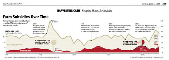
One really cool thing I read was the way you should present data, or if you even need to at all. Especially when it comes down to the line charts and bar graphs. The two are oil & water. You use continuous data with line charts, and sequential or broken up data for bar graphs.
As for my own delivery system. I want it to be presented with a geographical map. I am not sure what kind of data I am going to use, but I want it to have a sense of scale among the population. Interactive with the user if they want to delve deeper, but also I want them to understand as much as possible at a first glance. All of it would sit on the page along with it’s paired written content. I’ll have more as soon as I figure it out, but right now I need to find that sweet gold pot of data that I find interesting enough to build this project around. It’s going to be clickable, and possibly have some elements that link to text that reveal more information.
As of right now I want to have some form of data that relates to diet and the american population, or just Texas. Or maybe, something space related that the public should now about, but hasn’t had an opportunity or palate to digest said spacey information.