Most of the data I have gathered is of Colorado Ski Resorts terrain, expertise level, ratings for specific things, and more. I really like the stacked column chart I did because it shows the percentages of each mountain and where they stack up in terms of beginner, intermediate, advanced and expert slopes/terrain. This makes it easy to visually see what slopes are harder than others (Silverton Mt is straight up expert to the max). The next part of the data I wanted to portray is the highest points of each mountain, I thought the best way to do this was with a line chart. Here you can see where the heights compare to other mountains (Howelsen being the lowest mountain, and Silverton being high and scary). A section of the data has ratings on how each resort is ‘family friendly’ so I put this in a bar chart from lowest to highest rankings. This makes it easy to see which resorts are most family friendly or not. This last section is my favorite part. My data set includes the biggest vertical drops for each mountain. If you look at numbers on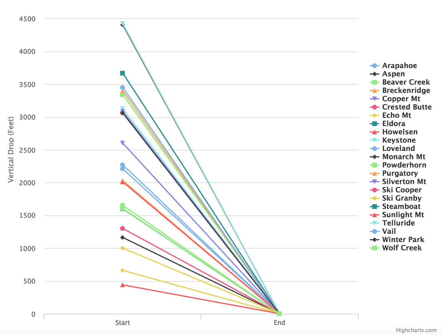 a page, a couple thousand feet sounds scarier than a couple hundred. But even still, these numbers on a page don’t do much justice when it comes to thinking about vertical drops. This chart I created is a simple line chart that has points from the top of the vertical drop (# of ft) to the bottom (0 ft). When you stack all the resorts and their vertical drops together you can see which ones have extremely steep drops and the ones that you can go down a little slower (You would find me at Howelsen where the vertical drop is only 440ft as compared to Telluride where it is 4,425 — HELL NO). You can check out these charts here
Project Ski (Three)