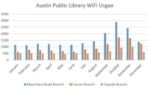
The dataset I used for this is from the city of Austin’s data databse. It charts the wifi usage in the branch’s of the public library throughout Austin. As I was looking over the data I realized that there is, across virtually every branch, a spike in the usage of the library’s wifi in the last quarter of the year. I only included three branches in the table above but the trend is the same across the majority of the branches.
Making the chart was a simple process. I merely selected three of the branches, narrowed the monthly results to the year 2015, selected the data and made a chart which I then did some light editing on to make the labels more clear. I’m hoping there’s a story here and will be reaching out to a few branches to find out if that is the case.
One concern I have is my uncertainty over how exactly to interpret the data. The only explanation of the numbers given is as follows: “The Library offers WiFi access at all locations. We pull the session statistics from Google Analytics monthly.” My working assumption is that the numbers represent either total number of users or unique users but this is not specified. I have looked for contact information on the site but have not found any. If anybody has insight as to how these numbers should be interpreted or who I could contact for clarification I would appreciate it!
