I knew when I started with my data that I was taking a risk. Selecting something that was as niche as Austin area video game cover bands (of which there are only a few), really did limit myself with the amount of data and numbers that I could show. After all these bands were small time. You wouldn’t see them breaking any attendance records at SXSW, or blowing away the competition with the the size of their respective social media communities. However, it wasn’t until I input the data into my code that I realized there was a problem at hand.
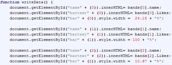
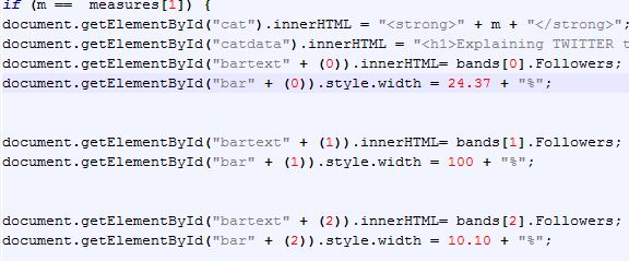
First off, one of the bands I had selected had a much greater following than the others which based on the pixel parameters that I had set for the bars had theirs running off the page. So I decided that setting the bar width of the largest act to 100% of the page and then calculating the others respectively would make the data work within the space.
Then it magically appeared:
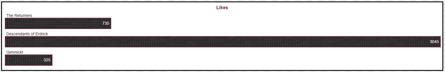
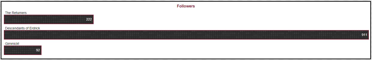
The proportions between Facebook likes compared to the Twitter followers of the three bands were almost identical. In fact when you look at the code, you can see that the calculated math based on the online communities is incredibly similar.
This was pretty astounding and interesting to find out. However, as far as for creating a visual story, didn’t leave much to show since the animation of the bars was hardly affected by a lack of proportional difference between the two major social platforms.
Yet, by this time I was committed to the data, and this was the story I wanted to tell. I just couldn’t quite decide how to build the story around it and have it displayed in such a way that might be interesting to a viewer and communicate my discovery. Luckily, Jesse shared a great idea in having the text underneath the main div to be tied to the drop down so I could briefly explain the findings. In order to further build another dimension to the story, I added the YouTube subscribers as another drop down element to not only show off those fancy charting animation skills, but to add another important profile and possibly discover what could be done to help the lesser two achieve a greater visibility overall.
So the story itself was shaped centered on how the data was to be displayed, and the numbers revealed a punchline all on their own they might not have otherwise as individual numbers stored away from each other. This shows just a glimpse of the amazing power that data journalism can offer and HOW the data chosen to display can, in-turn, shape WHY the data is important. I don’t think I would’ve discovered this about these three bands in any other way.
Now that I’ve explained a bit about what I learned from this project, please go check it out and feel free to let me know what you think!