Texas Music & HighCharts
http://w5748.net/highcharts/ | (GitHub Link)
Greetings coding compatriots!
This is the final output for my data visualization on the third assignment. For it, I decided to play around with HighCharts.js. Using this library, I wanted to create a line graph and a pie chart representing data from the Texas Music Office website.
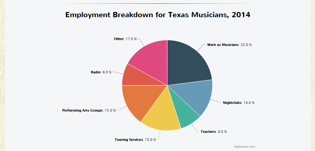
I chose these two particular vehicles because of how they represent information. Plotted lines, for example, are a clear way of showing change in numerical values: one look at the line and you can tell the scale, direction, and type of change that’s taking place. Likewise, I wanted to use a pie chart for the total employment because it’s a breakdown of percentiles- people want to be able to look at the image once and understand what percent of musicians are teaching, in a band, on the radio, etc.
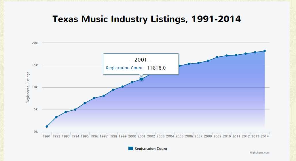
With that in mind, this is why I’ve done two different visualizations for this piece. I’ve started with (1) a graph line [above] showing the increase in total industry listings, and (2) a pie chart breakdown [below] of employment among registered musicians across the state. Although here they look like simple images, they possess interactive elements on the site itself. HighCharts handles these mechanics like a pro, and it makes them look fantastic on the page- if you’ve got a moment to spare- check it out!
Several takeaways:
I would love to remove the decimal points from the graph tooltip values. (If someone knows how to do this, mad respect.)Edit! Thanks to Professor Royal for helping me resolve this issue!- HighCharts was intuitive enough for me to pick-up, its markup strongly resembles another library I’m familiar with: Dygraphs.