After covering charting and a variety of different tools to create the perfect visualization that tells a story, I know have that much more knowledge on data journalism. The first of three tools we used in learning charting was Highcharts. This is a great website that lets you play around and practice using different types of charts. They have everything from pie charts to 3D charts, to the more advanced charts such as the heat maps. All of these are free to use and get practice with. One of the downsides to using Highcharts is when you are editing the code in JSFiddle, it has the code broken up into 3 different groups; the HTML code, the CSS code, and the JS code. Other than that, it is a great tool to practice using these types of charts and seeing the results as you go along.
The second online tool that I used was one called Chart.js. This tool is actually the one I used in creating my charting assignment. It has six very basic, yet powerful charting exercises that I obtained inspiration from. The zip file you download comes with a Bar, Doughnut, Line, Pie, Radar, and Polar-area charts along with all of their sources and documentation. I found it very helpful in having the guide-like file to refer to when I had specific questions about the code.
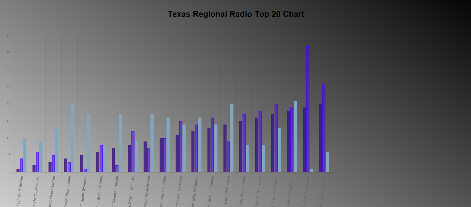
I chose to scrape the data from the Texas Regional Radio Report Top 100 songs for the first week of November, ending on 11/7/2014. After getting the data into an excel sheet, I was able to cut data that I knew wasn’t relevant and then transfer that data into a bar graph to display its contents. I was able to alter and adjust the example bar chart given by Chart.js to fit my data. Of course, I added some design to make it enjoyable and easy to look at.
I was happy to see that there were some correlation and some random numbers between the three different variables (current position, previous weeks position, and total number of weeks on chart).
For the last charting tool that I explored, as well as having Alex Levine as a guest speaker who works for the company come and talk to us about their charts, was D3. D3 is a data visualization company that produces awesome charts. These charts were definitely more advanced than the previous examples with more in-depth code that requires a higher skill level of coding. D3’s charts are extremely interactive and are great charts to use when telling very specific stories. I would enjoy taking the time break down their code for one of their charts and try to tell my own story with it but I didn’t have the time for this project.
Overall, the great thing about all of these charting tools is that they give you the ability to fork them so you can create your own story using your own data.