For this analysis I chose to practice selecting very specific data. This data pulled from Engima.io shows contributions made by both individuals and companies to the 2008 federal election campaigns in the United States. Specifically, these contributions were made in
Another Story, Another Chart
Now that I’ve finished my honors thesis (which oddly enough revolved around music and brand experience) I don’t get quite as freaked out as I used to when I open spreadsheets. However, I do think analyzing data is one of
The Final Project
For my final project, I would like to look at the development of music genres. Using the Million Song Dataset in this case study, I hope to look at the creation of genres based on both textual and musical elements.
Project 1- A Quiz
Everyone enjoys quizzes that somehow connects them to a character, place or idea. I have found people enjoy an extra touch when the quiz leads to the user discovering something new about them. My first project idea is inspired by that thought, this
Data Journalism
I believe data journalism is story telling at its finest. It’s the intersection of solid facts, stunning images and a strong voice. Instead of talking at our readers, we can talk with them. We’ve found a way to add the idea of
Data Journalism
I believe data journalism is any story that takes information and makes it visual, understandable and accessible to the average viewer. It transforms something measurable to something viewable, which in turn makes it something people can act upon. The visuals
Data Vis: Texas Music Industry
Texas Music & HighCharts http://w5748.net/highcharts/ | (GitHub Link) Greetings coding compatriots! This is the final output for my data visualization on the third assignment. For it, I decided to play around with HighCharts.js. Using this library, I wanted to create a line graph and
The Artists of #ACL (+GitHub)
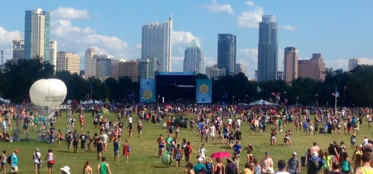
w5748.net/tweetmap/ The above was an exercise in pulling down Tweets with Python and mapping that information with the Google Maps API. The process involved coding, troubleshooting, and of course, visualizing data on the web. Of all the things I learned from this
Data Sources: Hipster Edition
Salutations coding compatriots! I hope you all had a good weekend and managed to find some interesting data to use for our current project. In the event that you’re still on the hunt, I’ve got a couple sources that you might want to
Some Data Sources
Here are a few places where you might find some interesting data for your first project: The City of Austin has a lot of data on their site and some areas specifically about music: ATX Music Division – an economic development accelerator