My favorite case study was the WikiLeaks war logs blog. I love stories that use maps and charts to tell a story about history or military statistics. To me maps are a very effective way of displaying a lot of information without making the user feel overwhelmed. They also give the user a since of orientation. Instead of just reading city names, the user can actually see where that city is in relation to the data.
Vox is my favorite website for finding informative maps and visuals like the WikiLeaks war logs. They have an awesome maps section that has some really interesting examples. My favorite is their Roman History map. It’s a perfect example of how you can make a really complex subject into a relatively simple one.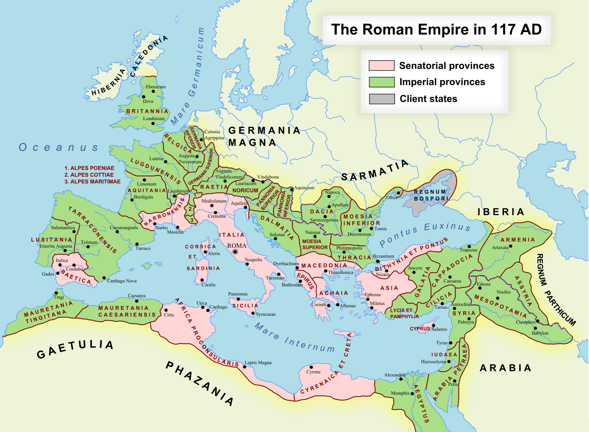
Vox also does a great job of displaying information in creative maps like this one on the United States’ Defense spending in comparison with other countries. Maps like this put the differences between expenditures into visuals that are easy to compare.