Of the case studies in the Data Journalism Handbook, I found most interesting the Citizen Data Reporter. I find it very cool that data journalism can help smaller communities. I think that usually when people think Data Journalism they think big stories from big media companies that affect a large population and this study showed that it can do more than just that.
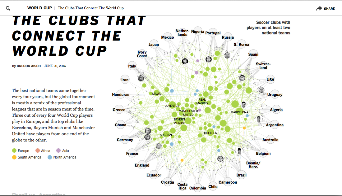
On of my favorite data visualizations was published this summer during the FIFA World Cup. The New York Times did a piece about the connections of World Cup players using an interactive that bring together the the club teams they play for and their home countries.
 As you scroll through the page other interactives pop up including one that compares rival teams Brazil and Argentina.
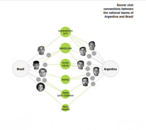
As you scroll over the teams that connect the national teams you see which players spend time together on club teams. 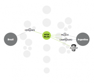 As you scroll a little bit more there is my favorite chart which connects European club teams to the National Teams. Instead of showing it through screenshots I encourage you to click the link.
Another of my favorite infographics is one that is more towards the “funny” side. It’s an inforgraphic on “Reasons to not move to Austin”. 