I really liked a quote from the third page of the section by Scott Klein at ProPublica: “It can help a reader understand their personal connection to a broad international phenomenon, and help them attach what they know to what they don’t know.”
The main point I took away from this chapter was that an app/data journalism project should be useful. It shouldn’t just be used once and tossed aside, but should produce more stories in itself and potentially become a resource for others. This means its usefulness won’t die several months later, but become a building block for more data research, projects, and applications.
Also, like we talked about previously, the type of visualization should make sense of, or enhance, the information in some way. Sometimes no visualization is better than a bad visualization. The hard thing, it seems, is to figure out the most effective way to show something to your reader, and get your point across in a way that speaks to them personally.
For my application, I’d like to create something that helps people decide what new restaurant to try in San Marcos.
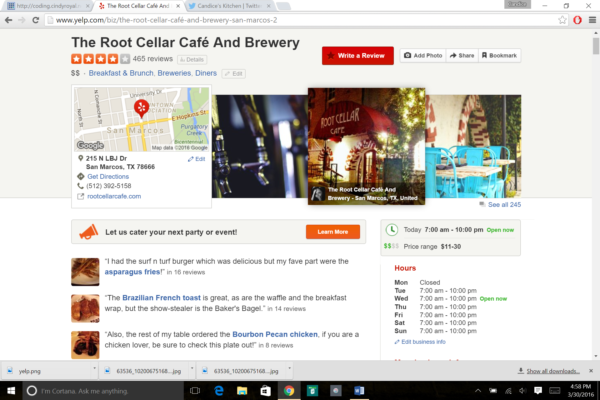
I’d like to present my user with several factors that may sway their decision-making when it comes to trying a new restaurant. I’d like to use the rating system on Yelp, since I believe it is the most-widely-used rating system for restaurants. I’d also like to indicate how well the restaurant does with providing healthy/locally sourced options. A few other factors might be outdoor seating, if the venue is kid-friendly, the food category, price range, etc.
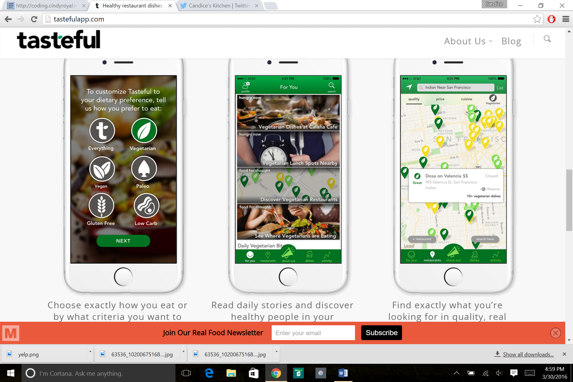
Yelp has a lot of this info, though most notably missing is the healthy/locally sourced info. I found at app at SXSW called Tasteful that is supposed to do something like this. It’s an app only, so I’ve yet to see if I can use their data.
I’d like to be able to ask the user questions about their preferences above and generate a few options that they might like to try. I’d also like the options to show up with all of these factors available for the user with their results.
I think since people are very visual about what they like to eat, I’d like to provide several photos of the establishment/food products as well. This could be a challenge, however, both with finding decent photographs of these local places as well as attaching several of them to a single result, for potentially hundreds of results (though that’s a bit of a reach if we’re talking about San Marcos eateries).
I’d also like to provide the option of the reader clicking on one of the decision-making factors and have a list of the restaurants that best meet that factor. For example, if someone wanted to just look up Mexican food, they could find it on an icon or dropdown and click to see a list of places around town that consider themselves Mexican food.
This will be one of the interactive elements, along with a questionnaire about their preferences. They can choose to do either. Once they answer the questions and results come up, they’ll also be able to find (hopefully) photos, other categorization factors, and a link to the restaurant’s website, if applicable.