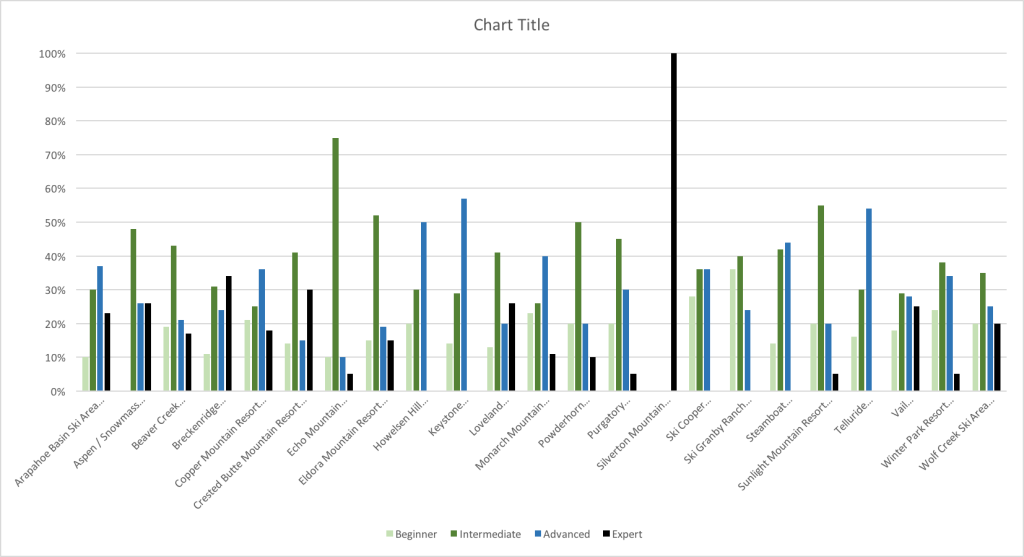
I gathered a good amount of data from onthesnow.com by using the super magical ‘importhtml’ tool in Google Sheets. It was seriously so magical and awesome. Out of the good amount of data I gathered, I wanted to make a chart that would be easily visible to see the expertise at certain resorts. Obviously I would be looking for something like beginner and would refer to the resort with the highest light green bar, because that means most of that resort has a lot of slopes for beginners. My dad on the other hand, would go straight to Silverton Mountain to go sling himself off a mountain again (he really did end up in the ER after he proposed to my mom and went down the crazy expert slopes). By looking at these percents in an excel sheet, it doesn’t really do much justice for what you would be looking for, but this chart is an easy look at what kind of slope you’re looking for based on your expertise level. 
On The Snow