I found ‘Covering the Public Purse with OpenSpending.org’ to be the most interesting case study in the chapters of the Data Journalism handbook. I have always had an interest on where tax money is going, and this data visualization ‘Where Does My Money Go’ is such a clean and beautiful way to show it (however, this interactive is for the UK). Anyone could go into a database and look at a bunch of ugly numbers and information that they may not be able to make sense of, but this project layout makes it so easy and appealing to look at and play with. Like many other awesome data visualizations I’ve seen, this one has a toggle where you can adjust your salary and below it will generate where exactly you’re money is going.
Although a static data visualization, I find this next one to be excellent! Vox created ‘The Year In News’ which shows what America talked about in 2014 via Twitter mentions. What you will find is a lot of talk about the state of the union, ebola in the US, and then an extremely escalated view of the ferguson shooting and ferguson grand jury. I know Interactive charts are much more fun, but such a simple chart like this is just great for this purpose.
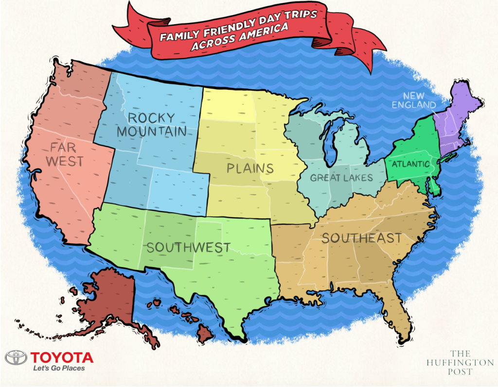
Last, and certainly my favorite.. I want to give a round of applause to the Huffington Post for making such a fun interactive visualization, ‘The Best Family-Friendly Road Trips Across America’. First, if you’re checking this site out, click on the southwest, Texas, then the McThrillers.. I love this interactive that they have put together, but for a family-friendly adventure, I thought this result was the sketchiest thing I’ve seen if you have children on your trip (but hey, I guess if you’re a ‘mcthriller’ family then you’re always down for living life on the edge haha). Anyways, back to the actual interactive graphic, I just love how this is displayed and put together, it’s fun, colorful, and something I find super awesome (especially since I love roadtripping). I don’t think the design could have been more spot on and perfect than it is already.
