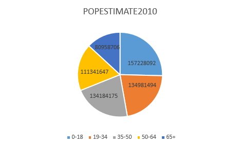
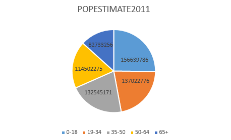
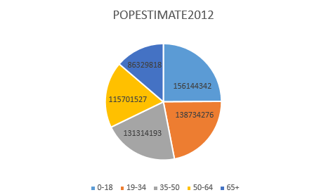
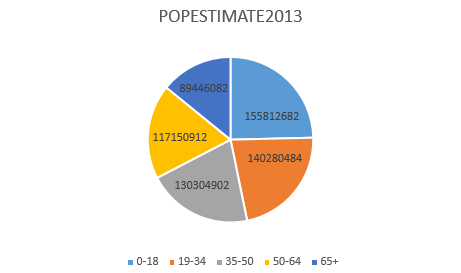
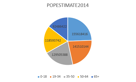
For my spreadsheet exercise, I pulled data from the US Census Report. The population numbers on the CSV file I used were scored by age, and I simplified it by categorizing the ages into age groups spanning from 0-18, 19-34, 35-50, 50-64, and 65+. Since the population data was also separated by gender (male, female, or other), I had to aggregate them into a unified table. With the resulting data, I created a pie chart depicting the breakdown of the estimated overall population for each year as calculated by the US government, from the years 2010 to 2014.
Excel Spreadsheet Exercise