Out of the available readings, I found the case study that looked at the campaign focused on crowdsourcing the water utility bill data for residents in France to be notable. Taking statistical information and displaying it in a way that can motivate or inspire individuals to a particular call to action is not an easy task. Especially if the results only affect a portion of the population, or a set of communities halfway round the world. Getting people to take part and actively approach the campaign is important because without their data it’s incredibly hard to display the problem or overview in a meaningful and effective way. Too little information can render a collection campaign useless, but with just the right amount of participation and data, voices and experiences can be viewed in the correct light and policies can start to be addressed or changed.
Through taking a risk on the collection method of having residents scan their personal water bill, the Prix de l’Eau project (http://www.prixdeleau.fr/) wound up with a credible form of data which helped increase transparency to what water companies were doing behind the scenes. Interestingly, the use of maps to isolate regions and areas affected negatively reminded me a lot of my own experiences of trying to manage utilities and resources properly in specific video game experiences.
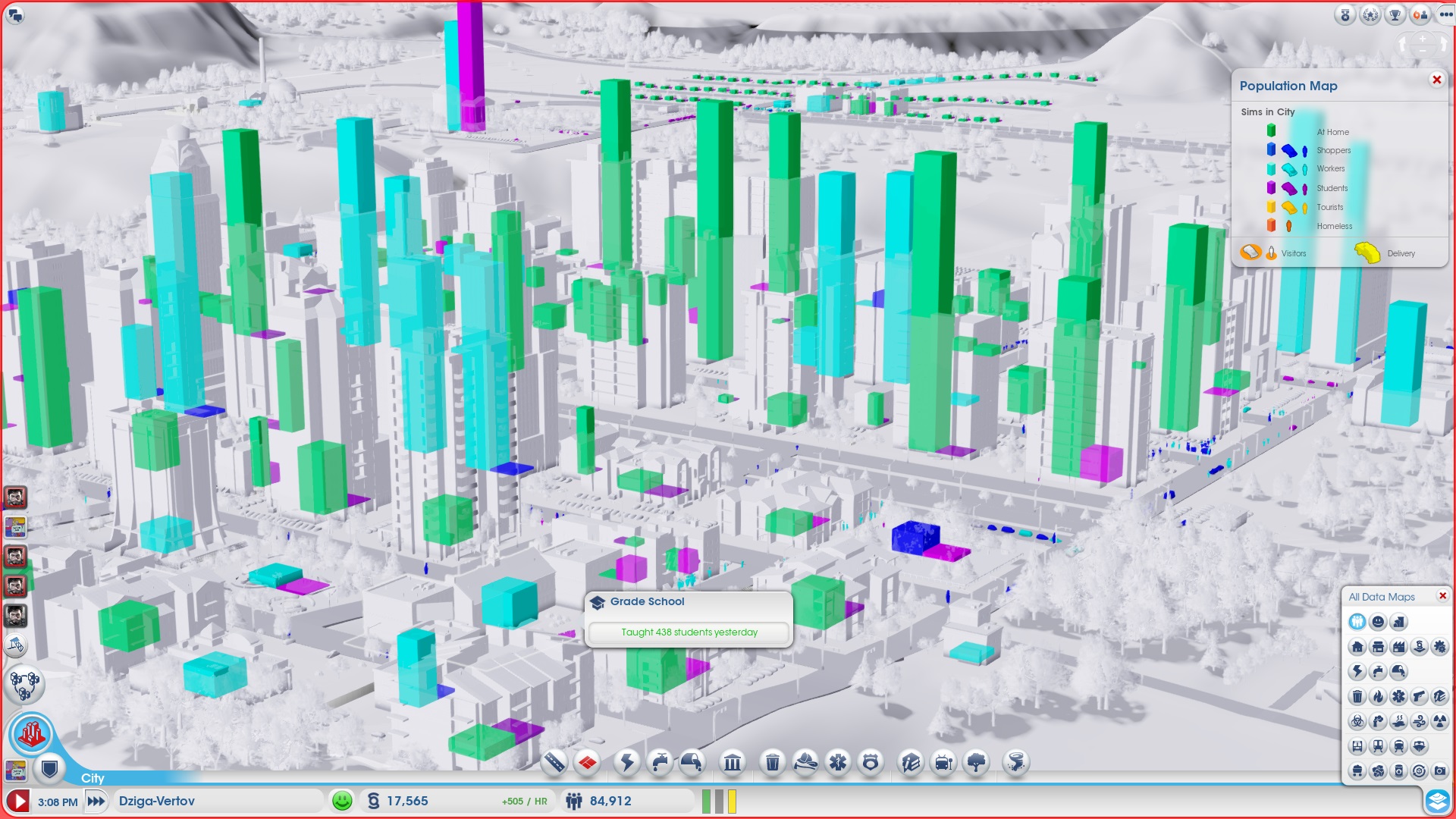
Planning and time management games such as SimCity (http://www.simcity.com/) have grown to become rich with stylized data visualization, and could help inspire new ideas for how information is displayed or shared in the living world. If anything, it helps us expand how we focus on real-world scenarios and ways to encapsulate and engage an audience with relatively dry material. Just look how much more interesting it is to view resident population data in a recent version of the game:
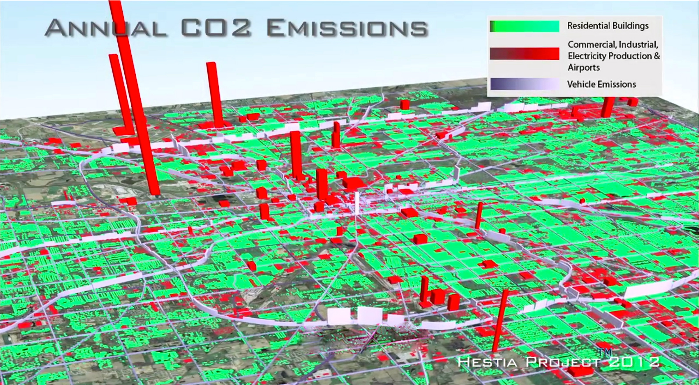
 Compare this to the Hestia project which was created by Arizona State University researchers (http://hestia.project.asu.edu/) in order to compile and display data obtained about CO2 emission sources:
  The lines between the way information is displayed in these examples are incredibly blurred, and we’ll likely find that as technology increases, both real and fictional worlds will explain large amounts of information is strikingly similar ways.
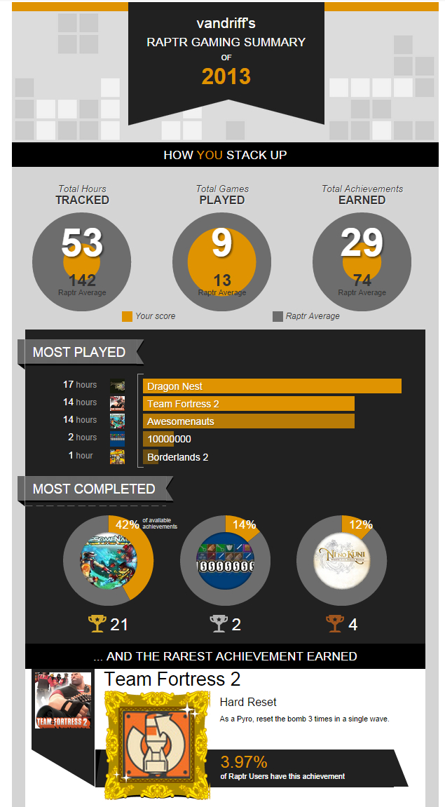
However, it’s not just in-game data that is affected by strong visualization types. Even a gamer’s own meta-data, such as how often a specific title is played, is getting a graphic overhaul. Raptr (www.raptr.com) is a free online social platform service that keeps track of detailed gamer data and trends. In the past they have provided detailed infographics for their users to show habits and trends in gameplay or time spent playing:  Their use of this information has been readily available in a static format, but as these outlets continue to populate and grow we’ll likely find that the interactive data communication element will also continue to evolve. Here is an example of a gamercard widget that allows users to showcase the top stats relative to the system or console data they are tracking:
 Video games are an innovative playground when it comes to building a story, easily sharing information, or helping solve problems within the context of a virtual environment, both inside and out of the game. These experiences can showcase cutting edge data manipulation and interactivity, especially with graphical advancements at an all-time high. Developers are constantly paving new paths when it comes to data observation in games and working to display that information through interactive formats. We can expect to continue looking towards gaming as a platform that will emulate as well as drive forward new strategies and thinking in data visualization that can be used in journalism to keep individuals engaged and interested in the information that is presented.